The votes are tallied and the polls are closed. It's time to share who's won this Sliver-themed Altered Reality Challenge.
Before getting to far along, I'd like to thank our four judges who helped make this possible:
- Eric Klug – Well known for his work in altering Magic cards.
- Mike Linnemann – A former art director in the gaming industry and Vorthos aficionado.
- Heather Lafferty – Gathering Magic's newest team member, stepping in as our Community Manager and resident Angel.
- Marshall Sutcliffe – You may recognize him from the Limited Resources podcast and his work on DailyMTG, but he's also a skilled alterer in his own right.
Several of the judges provided some feedback and thoughts on the submissions, and you can see that for each piece below. As a reminder, judges were scoring as follows:
- Creativity – 10 points – Is the idea unique, clever or engaging?
- Execution – 10 points – Is the alter well done, with skill and attention to detail?
- Complexity – 5 points – How complex is the alter?
- Thematic – 5 points – How well does the alter fit the theme?
The scores you see are the average across across judges. The "Total" is the fraction of the total points available from all judges that submission scored. (The maximum is 1.0, which would be a "perfect" score.) The highest and second highest total scores are the Judges winners.
Take a look over the submissions one last time, then find the Community and Judges winners listed at the bottom!
Predatory (Predator-Hunt) Sliver by Casey Snipes

| Judges | Comments | ||||
|---|---|---|---|---|---|
| Eric Klug | You can immediately gauge the amount of effort Casey put into this alter. It's a complete overhaul, going as far as to paint most of the text box. The Predator's expression/pose is what gets me most, and it really hits home the narrative. I also appreciate the Giger-esque Sliver design—what I imagine is a nod to the Aliens vs. Predator franchise. A nice touch. | ||||
| Heather Lafferty | The missing arm was hysterical. I loved the creativity of this alter. The complexity and execution would need to be raised before I considered purchasing it. | ||||
| Mike Linnemann | It’s great line work with really hastily-made coloring. I see a comic-book background, which pushes the visual storytelling he's doing. He probably needed a day or two more to complete everything. It's how it is! | ||||
| Aggregate: | Creativity: 7 | Execution: 4.5 | Complexity: 4 | Thematic: 3.75 | Total: .642 |
Birth of a New Species by Black Wing Studio (Ron Faris)

| Judges | Comments | ||||
|---|---|---|---|---|---|
| Eric Klug | Ron really bit off a lot with this alter, and I certainly applaud his ambition. As he mentions in his own description, the execution is what hurts him the most here. For what it's worth, the Sliver Queen was immediately recognizable, and I got a sense of what he was going for. With a concept this complex, however, you really have to hit the painting out of the park. | ||||
| Heather Lafferty | The concept of this alter was my favorite out of all the entries. It could stand to be a little cleaner in some places, but I really loved this alter and the idea of following evolution. | ||||
| Mike Linnemann | I can't tell what's going on here. This alter really needs some editing. The left sliver is great—just do that! | ||||
| Aggregate: | Creativity: 7.5 | Execution: 5.75 | Complexity: 4.5 | Thematic: 3.75 | Total: .717 |
The Hive by Thomas Parker

| Judges | Comments | ||||
|---|---|---|---|---|---|
| Eric Klug | Wow, what a massive project from Thomas. The hardest part about doing mural-like works is that the pieces are going to be separated if you ever want to play the cards in a deck. That Steelform Sliver looks a tad strange without its brothers flanking it. Maybe playing the individual cards wasn't Thomas's intention, but it's something to think about. Still, I like the combination of Slivers old and new and the connection to the Sliver mechanic in general. | ||||
| Heather Lafferty | Multi-card alters are a neat gimmick, but what really makes it awesome here is how well the hive is shown. I can't think of a better use of multi-card alters than slivers. | ||||
| Mike Linnemann | Edit, edit, edit! It's too much. The Mnemonic Sliver could've been enough and great as is. That said, showing a bunch of alterations together is incredibly flavorful for a sliver hive. | ||||
| Aggregate: | Creativity: 7.25 | Execution: 6 | Complexity: 4 | Thematic: 4 | Total: .708 |
Predator Sliver by Greg Jackson

| Judges | Comments | ||||
|---|---|---|---|---|---|
| Eric Klug | The merging of old-school Sliver and Predator design is an interesting one. I'll be honest: All the Predatory Slivers that recall the Predator movie are hurt a little bit by multiple entries doing the same thing. That said, this is still a compelling idea that I'd like to see pushed in execution. | ||||
| Heather Lafferty | The proportions on this alter were a little off for me. | ||||
| Mike Linnemann | Torso is great; the tail/snake body needs to be integrated instead of an afterthought. Also, these’re great extensions over the text. | ||||
| Aggregate: | Creativity: 5.5 | Execution: 5.75 | Complexity: 3.25 | Thematic: 2.75 | Total: .575 |
Roger, Sliver Queen by Josh Dearing

| Judges | Comments | ||||
|---|---|---|---|---|---|
| Eric Klug | I'll preface my critique by saying I'm not a big American Dad fan. When working with pop-culture references, I think it's important to choose extremely well-known and popular imagery. AD feels a little too contemporary for my tastes, and I'm afraid the humor of this piece is lost on too many viewers. I do enjoy the incorporation of Sliver Queen's background and talons and the extra effort given to changing the text. | ||||
| Heather Lafferty | The alteration is a little sloppy and needs cleaning. I also don't watch a lot of TV, so I am left a little outside of the joke on this one. | ||||
| Mike Linnemann | I hated this, then loved it, and then disliked it, and I keep going back and forth on it. I know that neo-Nazi alters and anti-gay cards exist. This is the comical line of it, and I'm not sure if I can support that. It's clever, but it’s not for me. | ||||
| Aggregate: | Creativity: 5.13 | Execution: 3.5 | Complexity: 2.75 | Thematic: 2.25 | Total: .454 |
Submission by Matthew Kolongowski

| Judges | Comments | ||||
|---|---|---|---|---|---|
| Eric Klug | It’s a normal extension, but it’s a reasonable one all the same. I think in this instance that keeping the text box may have been a better choice, as all that empty space overwhelms the composition. That's something to think about; too often, card alterers may not consider how the textual elements interact with art. Keeping or obliterating part of the original card can make or break a piece. | ||||
| Heather Lafferty | This is a beautifully-well-done alteration. It is clean and clear and what I would want the end product of an alter I purchased to look like. | ||||
| Mike Linnemann | When extending, add something! Make it flavorful, and show us Shandalar! | ||||
| Aggregate: | Creativity: 5.5 | Execution: 7.75 | Complexity: 2.75 | Thematic: 2.25 | Total: .608 |
Winged Sliver 2.0 by Daniel Truong

| Judges | Comments | ||||
|---|---|---|---|---|---|
| Eric Klug | I really enjoy a lot about Daniel's style. The coloring and perspective of this piece are really nice. I also appreciate Daniel's foresight to simply reimagine Winged Sliver. An old-school flying Sliver exists already; referencing it is a smart way to go! I think the background could have been blended a little better and a little more detail given to the Sliver's anatomy, but overall, this one's heading in the right direction. | ||||
| Heather Lafferty | It felt to me the sliver was transposed into his environment and not natural to it. I think this alter would have been more striking if the background were altered significantly as well. | ||||
| Mike Linnemann | This could be a quick sketch in a style guide on how to deviate from the normal sliver design. It fits quite well, and it saddens me that slivers didn't go through a ton of revisions to update them, as with this alter. | ||||
| Aggregate: | Creativity: 6.5 | Execution: 5.75 | Complexity: 3 | Thematic: 4 | Total: .642 |
Full-Art Sliver Queen by Stefanee Schofield

| Judges | Comments | ||||
|---|---|---|---|---|---|
| Eric Klug | When doing an extension, I think the most important thing an artist needs to keep in mind is style. You're not just mimicking color, you're mimicking application as well. Here, the foreground elements are a fair bit more linear than Ron Spencer's original vision, and that breaks down the illusion that this was how the card was originally printed. I also feel the signature is a fair bit distracting and could stand to move to a corner in a darker, more neutral color. The bright side is that with a little more attention given to this piece, the overall quality could be much improved. | ||||
| Heather Lafferty | If you decide to go the route of doing an extended alter, it needs be super-clean. | ||||
| Aggregate: | Creativity: 4.25 | Execution: 4.25 | Complexity: 2.75 | Thematic: 3.75 | Total: .5 |
Classic Sliver by Marina Velo

| Judges | Comments | ||||
|---|---|---|---|---|---|
| Eric Klug | Here’s a reasonable return to the old-school Sliver design. This entry could benefit greatly from a connection to the card's name and abilities. There's nothing here to tell me why or how the Sliver does what it does. | ||||
| Mike Linnemann | Here’s a great first run through to get a concept in. Tightening details and bringing the alter into focus would make for a really incredible alteration. Also, covering the reminder text always irks me. | ||||
| Aggregate: | Creativity: 5.75 | Execution: 4.75 | Complexity: 2.5 | Thematic: 3.25 | Total: .542 |
Submission by Dan Livant

| Judges | Comments | ||||
|---|---|---|---|---|---|
| Eric Klug | Here’s another comedic effort applied to Predatory Sliver. Apparently, it’s Magic 2014's most amusing Sliver. I like this concept a lot, as it's both good for a chuckle and conveys the ability of the card. Though I suppose Popeye never made anyone else stronger. This one would be a slam dunk for me with slightly better execution. Because the concept references a cartoon, I want to see less gradation, flat color, and sharper lines. | ||||
| Heather Lafferty | I love concept, the play on the character with sliver function, and the execution—just perfect. | ||||
| Mike Linnemann | This is a strong hit in my book. It's deconstructing the creature type, distilling it down to putty, and remaking it into something similar. This has been done for years with My Little Ponies and Warhammer, among other things. I like this alter; good work. | ||||
| Aggregate: | Creativity: 8 | Execution: 6.25 | Complexity: 4 | Thematic: 4.25 | Total: .750 |
Submission by Yuri Milbrand
iv align="center" style="clear: both; margin-bottom: 10px;">
| Judges | Comments | ||||
|---|---|---|---|---|---|
| Eric Klug | I recently commissioned a card from Yuri, so I'll do my best to not have my appreciation of this four-year-old's work color my judging. The best thing about a young artist's work is the confidence it exudes. There's little doubt in the lines or the choice of colors. Later on in our careers, we sometimes take ourselves too seriously and worry about the finished product and what the viewers may say about said product. Luckily, Yuri's not there yet, and I truly believe (regardless of his age) that this piece is fresh and exciting. That said, it's a bit of a mismatch for me in terms of card choice. Come on, dad; if you showed him a Sliver Overlord, give him a Sliver Overlord! | ||||
| Heather Lafferty | I can't think of anything better than kids drawing the monsters they see in their imagination. | ||||
| Mike Linnemann | I have two questions: Is this good art for a four-year-old? And does entering a child's drawing mean that anyone can do art and that saying, "My child can do this," has come to its eventual conclusion? | ||||
| Aggregate: | Creativity: 7.25 | Execution: 6 | Complexity: 2.5 | Thematic: 3.25 | Total: .633 |
Submission by Michael Comby

| Judges | Comments | ||||
|---|---|---|---|---|---|
| Eric Klug | Michael really went all out in trying to convey the ability of the card, and it shows. The execution could use some work, in which case I would suggest just refining the details. Higher contrast in the body, for example, would really help push the metallic feel. | ||||
| Heather Lafferty | The part of this alteration I found the most striking was the grass. The brown-and-beige-grass spectrum of colors I really liked. | ||||
| Mike Linnemann | The arrow isn't needed. The fan lower body is really nice. I see the anatomy in the shoulders, and that deviation is nice. | ||||
| Aggregate: | Creativity: 5.5 | Execution: 4.5 | Complexity: 2.5 | Thematic: 3.5 | Total: .533 |
Submission by Lindsay Burley


| Judges | Comments | ||||
|---|---|---|---|---|---|
| Eric Klug | I think Lindsay must have picked one of the better Slivers for 3D’ing. Those streams of green really enhance the illusion of the 3D card. I would have liked to see better photographs, as it's a little difficult to grasp the fine details, but that's something I'm always looking for in 3Ds. | ||||
| Heather Lafferty | What a great card to do a 3D alter of—and challenging. I love that it is not only a 3D alter but has extended alteration as well. | ||||
| Mike Linnemann | The rectangle is incredible, with a great sense of depth. The areas above with straight lines are just killing me. If you go into that much detail, why haphazardly paint two green lines? C'mon, you're better than that. They look hastily-made, which is against your normal work. If you swing for the fence, do it, and own it! | ||||
| Aggregate: | Creativity: 7 | Execution: 6.75 | Complexity: 4.5 | Thematic: 3 | Total: .708 |
Sentinel Sliver – Classic Look by Bradford L. Heeder

| Judge | Comments | ||||
|---|---|---|---|---|---|
| Eric Klug | Bradford does a good job of converting the new-school Sliver to the likeness of its older brethren. Much like Matthew’s piece, I feel keeping the whole textbox and title bar instead of tightly cropping it would have benefited the piece greatly. It would help compositionally, not to mention making everything look cleaner. | ||||
| Heather Lafferty | The thickness of the paint and air bubbles in the paint made it hard for me to focus on the actual painting of the sliver. | ||||
| Mike Linnemann | I see what Bradford is trying to do. He's trying to get a more painterly piece while maintaining the look and feel. In doing so, he delved in a bit too deep. Alters these days have moved into the as-smooth-as-possible look due to players still wanting to be able to use them. For example, his head should be very thickly applied in order to hit that ideal. By not doing so, it looks more like a scarecrow than a finely detailed sliver. | ||||
| Aggregate | Creativity: 4.75 | Execution: 3 | Complexity: 2.5 | Thematic: 3.5 | Total: .458 |
Submission by Max Weber

| Judges | Comments | ||||
|---|---|---|---|---|---|
| Eric Klug | While the color-matching is fairly reasonable, Max's submission suffers most in execution. I often see this textural problem, and it can be solved by using fluid acrylics (as opposed to heavy-body acrylics) and slowly building up color rather than trying to cover an area in one or two layers. It's a matter of becoming comfortable with the medium, and it takes time. | ||||
| Heather Lafferty | The tunnel effect is striking, but I'm not sure the concept for this alter really displays anything unique or creative about slivers. | ||||
| Aggregate: | Creativity: 4 | Execution: 2.5 | Complexity: 1.75 | Thematic: 2.25 | Total: .350 |
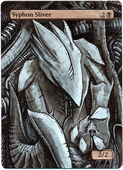
It's Evolution, Baby! by Brandon Brown
| Judges | Comments | ||||
|---|---|---|---|---|---|
| Eric Klug | Even before reading Brandon's description, the Giger reference is immediately apparent. The monochrome palette is what I like most about this alter. Too often, we forget how much can be done with limited palettes. This piece could be improved by going even further with the detail, particularly in the body, but I'm nitpicking here—it's already a fine work. | ||||
| Heather Lafferty | The second you look at this alter, you understand you are dealing with a species nothing like our own. It almost looks as though it could be a movie poster for Slivers. The alteration work on this card looks really in-depth and detailed as well. | ||||
| Mike Linnemann | This is actually hitting the prompt. Good work. | ||||
| Aggregate: | Creativity: 8.75 | Execution: 9 | Complexity: 4.75 | Thematic: 4.5 | Total: .9 |
Apex Sliver by Amanda LaPalme
| Judges | Comments | ||||
|---|---|---|---|---|---|
| Eric Klug | Is this a Predator-inspired piece not on a Predatory Sliver!? Blasphemy! My favorite aspect of this piece is the light, which is great and really conveys the jungle setting well. I enjoy the loose brushwork in the background, but I would have liked to see tighter work in the figure: more detail and so on. I have an obsession. | ||||
| Aggregate: | Creativity: 5.75 | Execution: 6 | Complexity: 3.25 | Thematic: 2.25 | Total: .575 |
Here they are, the winners for Altered Reality Challenge 6! Remember, first place in both voting buckets receives a $30 gift certificate to CoolStuffInc.com, with the runner ups in each receving $15.
Community Winners
- First Place (329 votes): Apex Sliver by Amanda LaPalme
- Second Place (220 votes): It's evolution, Baby! by Brandon Brown
Judges Winners
- First Place (total score of 0.90): It's evolution, Baby! by Brandon Brown
- Second Place (totals core of 0.75): Submission by Dan Livant
Congratulations to the winners! With Gen Con Indy 2013 kicking off today, I'll be reaching you early next week to confirm all the details for your gift certificates. To everyone else, please keep your eyes open for the next challenge: It's going to be something for the history books!