


When you make an image, no matter what the medium or style, the whole point is communication. I’m trying to get an idea out of my skull and into yours; how, where, and in what context I choose to do so is part of the challenge of the creative mind. Things can easily go awry as your brain interprets what mine was trying to say. If my goal is accuracy, I have to do anything I can to clarify the message.
Because right now, I really, really want you to think of a—

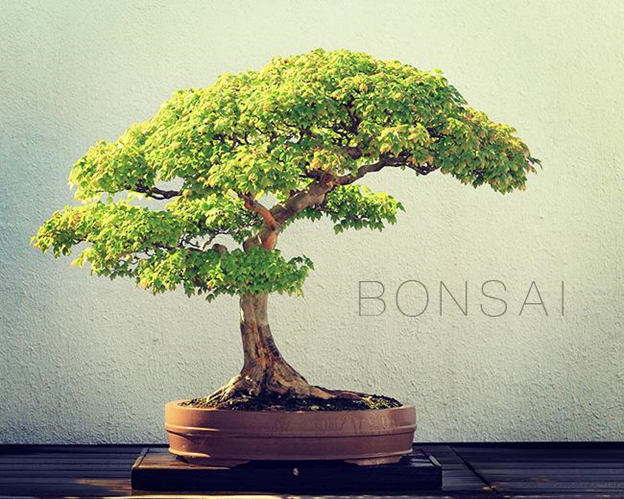
Photo by Sage Ross via wikimedia commons
But maybe there’s a specific message I’m looking for you to pick up. Maybe I don’t want you to think green, minimal, tree, earth, or wood. Maybe I want you to have emotional context, and I need to shift the color balance to give you that nostalgic feel. Thankfully, we have a program for just such an occasion: Adobe Photoshop.
Photos are lovely, but Magic is a world that is illustrated, rooted (no pun intended) in the fine arts. My message has to be able to translate to a hand-rendered medium. I want you thinking in the headspace of the gaming world, of dice-chucking, card-flopping, pen-and-paper-style gaming. I need physicality; I need a Pilot G2 07.

But what’s an image without color? This is nice, but it only tells half the story I’m looking to convey. We need strong colors, and digital, too, because everything has to be able to be e-mailed, tweeted, Instagram’ed, or pinned. We have to keep it simple, bold, and preferably vector.

Great. Now, take all those different elements and combine them into one.
We need a simplified digital form that can take or leave color. It should incorporate some minor line work to give it a little more weight and help it stand out. It needs to have only the most important aspects of the form it’s referencing . . .
Oh, and it needs to be able to reproduce at about an eighth of an inch tall.
One last thing: There’re almost one hundred forty of these symbols that already exist, and it has to be distinct from all of them.

Every time a new Magic set hits the market now, that’s a sampling of what need to be taken into account.
Icons are essentially visual shorthand. For various reasons, there isn’t the time, space, and/or desire to express the idea in a detailed representation. Anything short of the physical presence of the object is an abstraction of some sort, but some forms of image making take it to a different level. Highly stylized and viciously minimal, the icon gives you barely enough information to work with. In some cases, the design purposely leaves massive information gaps, and our brains magically fill in the rest. Icons are just as much a psychological trick, as they are a piece of visual information, the optical illusion of the commercial art world.
In Magic, the set icon is a piece of information that immediately gives you, the player, something very important: context. Without this symbol, only those with an encyclopedic knowledge would know the source set for a given card. In a game in which the majority of the Constructed formats contain strictly governed card pools based on set, this couldn’t be more important. In addition, the icon gives you a general idea of the card’s rarity and therefore worth (though by no means absolute; just look at Serum Visions vs. Tibalt, the Fiend-Blooded), the part of the Magic storyline that it fits into, and the ability to find similar entries that fit the card’s theme.
Magic has been around for over two decades. Just as the rest of the game has grown, so, too, have the set symbols evolved. In my review of the main expansion icons, I came across five distinct categories, or movements, in the approach to icon creation. These are by no means distinct or complete, as we will easily hit one hundred fifty symbols before the end of 2016, but it is meant as more of a general survey of the history and methodology of set symbols.
I’ve also included some cultural landmarks to help provide some context of the world these symbols were unleashed upon. It’s easy to scoff at early efforts from a 2015 perspective until you remember some of these logos are older than many of today’s players.

1993–2000
Original Sets | Ice Age | Mirage | Tempest | Urza’s Saga | Mercadian Masques
Movie: Jurassic Park
Videogame console: Super Nintendo Entertainment System
Computer OS: Windows 3.1 | Mac System 7
Fittingly, the story of set symbols starts in 1993 with the very first proper expansion to Magic: Arabian Nights.
Arabian Nights was originally intended to be completely separate from the original set of Magic: The Gathering. Creator Richard Garfield’s vision was for the cards in Arabian Nights to have a similar, but differently-colored, card back, in this case purple and gold. The idea being that you were free to mix the cards or play Arabian Nights separately from the core game.

Yeah, we almost got this.
Feedback from test groups and from within Wizards eventually convinced Garfield to keep the universal card back we all know and love, opting to represent the set with a tiny icon in the mid-right-hand space between the artwork and text box. The single jagged scimitar established a precedent that continues to this day.

Icons from this era deal with concrete items that can be found in the worlds themselves. From the waving banner of Alliances to the stoic anvil of Antiquities, what you see is literally what you get. There tends to be a higher level of detail in many of the icons from these sets, using fine line work and complex details to really spell out the image. There are no mistakes to be made with the dual cogs of Urza’s Saga, and when you see the thunderheads from Tempest, you know exactly what you’re getting yourself into.
There’s a lot of experimentation going on here, as there was in the rest of the development cycle of the game. Some of the results were less than perfect (trying to see the crescent moon from The Dark on a black spell), some were sublime (the charm icon from Visions, a decade ahead of its time).

This era also encompasses another watershed moment in the development of the set symbols: color to indicate rarity. The final set from the Tempest block, Exodus gave players yet another important piece of data by marking rare cards with a golden set icon, uncommon with silver, and commons with the classic black and white.


2000–2004
Invasion | Odyssey | Onslaught | Mirrodin
Movie: The Matrix
Videogame console: Playstation 2
Computer OS: Windows 2000 | OSX 10.0 [Cheetah]

Icons from this era waver back and forth between a newer, more geometric look and the classic, detailed approach that can be found in Magic’s roots. You’ll have the super-clean, tear-streaked mask of Apocalypse immediately followed by the wild organic shapes of Odyssey’s Mirari. From the ten-thousand-foot view, this is consistent with what was happening in the game in general. This time period marked a lot of changes in the overall structure of the game, from set design to tournament construction.

This also marks the first time we would see symbols that were geometrically perfect become the norm. Many of the images in this era are symmetrical, using perfectly round ellipses to form curves and sharp corners to push contrast. The stroke along the outer edge of the icons became perfect and uniform as well, bringing a much needed sense of professionalism and commercial appeal to the game as it stepped into the public eye more than ever. We conclude appropriately enough with the Mirrodin block and the beginning of what Wizards of the Coast formally recognizes as the Modern era of Magic.

2004–2008
Kamigawa | Ravnica: City of Guilds | Guilds | Time Spiral | Lorwyn
Movie: Serenity
Videogame console: Xbox 360
Computer OS: Windows XP | OSX 10.4 [Tiger]
This is where we really start to see a strong sense of consistency in symbol design. With art direction for each subsequent set becoming tighter and tighter, it makes sense that each icon would become more standardized and uniform in its presentation.
For the most part, we are seeing true icons. These are simplified vectors that are still recognizable for concrete images while conforming to a square aspect ratio. The geometry is immediately apparent and pleasing to the eye, reducing cleanly to fit any need. The symbols also begin to reference one another within a block, and not just in style. The dualistic nature of Morningtide and its dark counterpart Eventide are clearly linked and interrelated by their icon designs.

This era also encompasses the Time Spiral block, which took the visual design of the cards in a different direction. While Future Sight introduced a bold new, design for card borders, Time Spiral took a brief tangent by including a new rarity level unique to the set: timeshifted.

These special cards were denoted by a purple fill, a short-lived but prophetic change by having four rarities in a single set.

2008–2012
Shards of Alara | Zendikar | Scars of Mirrodin | Factions | Innistrad
Movie: Wall-E
Videogame console: Nintendo Wii
Computer OS: Windows Vista | OSX 10.6 [Snow Leopard]
Continuing on the path established in the iconic era, we come into a period of geometric abstraction. Set symbols became so well executed, so confident, that they began dealing with concepts that have no tangible reference point. This marks a significant departure from everything that had preceded the symbols, one worth noting.

If a set icon would reference a ninja throwing star (Betrayers of Kamigawa), we the audience have a mental reference to what a physical throwing star looks like. The artist is able to draw on our collective culture awareness, in this case via martial arts movies and Saturday-morning cartoons. Our brains are already primed to think in icons, and when the form is so unique as a throwing star, it’s as close to a guaranteed reception as you’re going to get in this industry. On the flip side, if the cultural understanding is too strong, a departure can cause the opposite effect. We can just as easily recognize what we’re seeing but vehemently dislike it as it clashes with our expectations (just think about the explosion you see on social media from all the thirty-somethings every time someone reboots a classic franchise from the ’80s).
Here, though, the symbols start representing things that we have no collective expectations of whatsoever. In contrast to our ninja weapon, the Zendikar block is showing us the opening of the hedrons that had kept the Eldrazi at bay. I’m going to go out on a limb and assume there aren’t any extraplanar beings reading this article (apologies to Nicol Bolas; I know you’re everywhere), so we pretty much have to take it on faith that this is an accurate depiction of a subject that is inherently beyond our understanding—a convenient metaphor, as the word icon was originally a reference to religious artwork.

The introduction of mythic rares in Shards of Alara marked the latest major change to all set symbols since Exodus. There was now a fourth rarity to show, which itself evolved over time, adding and subtracting a secondary stroke to help define the image against various card borders. This was eventually cleaned up with the new border designs introduced in Magic 2015.

2012–2015
Return to Ravnica | New Guilds | Theros | Khans of Tarkir | Clans | Battle for Zendikar
Blockbuster movie of the era: The Avengers: Age of Ultron
Videogame console: Playstation 4
Computer OS: Windows 10 | OSX 10.11 [El Capitan]
The most recent Magic icons are a curious mix of progression and nostalgia. Over twenty years since that first sword of the Arabian Nights, we see the return of concrete symbolism. The recently completed Khans of Tarkir block contained direct references to the core imagery with its crossed swords and dragon heads. The Return to Ravnica block demonstrated a bit of cleverness in its construction by allowing the symbols from the first two sets to combine in their entirety to form the third (a trick repeated in the following Theros block). Even the core sets between 2010 and 2015 became rather overt: This is Magic, and this is what year it is.

The main difference between this era and the original is, for me, confidence. All of these symbols have that professional look, that polish that speaks of quality. But there’s something more here, especially in the most recent set of Magic Origins that I feel is worth mentioning.
I mentioned before that the symbols had become geometrically perfect, and that’s been the case for many years. I’ve personally recreated most of the set symbols inside Adobe Illustrator, and I can say, having looked under the hood, in most instances, once you’ve created half the set icon, you’re done. Just copy, reflect along the vertical axis, and viola. It’s clean, it’s correct, it’s professional . . .
But it’s also mechanical.
Magic is a game with a lot of history and a lot of soul. It’s a world that’s been touched by the hand of many a creator, and one of the problems of having so many people involved in such a massive undertaking is that with every person you add to the mix, the urge to control those people rises. For a while there, I can see where the control went over the top, things were too tight, images were too well defined ahead of the input of the artist, everything was being done in the perfect digital world. It was becoming, on some level, homogenous.
But the creative team at Wizards is made up of some very smart people, and you can see where they recognized what was happening and have allowed the pendulum to start swinging the other way.
Check this out.

It would be painfully easy to create this logo using snapped-to angles with razor-sharp corners and perfect circles. But they didn’t go down that road. Hell, this thing isn’t even symmetrical. There’re all these little weird curves that don’t need to be there . . .
. . . Which is exactly why they are.

It’s genius. They’ve gone from having all the skill and tools and expertise to make things absolutely spot on to now having the confidence to allow that fundamental difference, that human element, to shine through. It’s a rare level of expertise that allows balance.

I hope that, in this article, I’ve been able to show that the icons have come to represent far more than just the sets they are associated with. Each one contains an incredible amount of history, not only on where it is from, but why and how. These icons are landmarks that are overflowing with clues to guide us through the history of the game itself. It’s my grand hope that, as the game moves forward and the Battle for Zendikar rages on, that we continue down this path, of wonderful, inspired, confident creativity.