


With three colors down, we have two to go with lands, artifacts, the dreaded Slivers, and my Top 5. (Again, I’m going to keep the Slivers as a grouping at the end. It’s easier for both of us, and you’ll see why.)
Two quick notes:
- Look for purple.
- You know the original art pieces for the traditional works of outstanding quality? You literally just missed them . . . or you have minutes to contact the artists. Good luck.
Without any break, let’s dive in!
Red
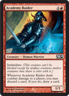
What is that artifact, and why am I looking at it? Does this warrior have an artifact that he’s discarding?
Why would he get rid of powerful magic? Is it not powerful? Is he throwing it on the ground?
Karl’s armor is great. Years of Warhammer work will do that to your eye. Daarken also has a strong view of armor from Warhammer. He’s incredible at Dark Elf armor—oh man.

I love this concept so, so much. It’s just so simple and so clean as a top-down design. “Living land” plus “big” equals “giant.” Awesome.
Could it have been a living volcano with fire and such? Sure. Made into a titan? Probably, but this really works as a design.
I’m not as excited about the overuse of gray on the giant. My mother grew up in Northern Minnesota, where mining pits are everywhere as people are looking for iron ore. Very, very rarely are they of a consistent color or type. When I saw the Grand Canyon, I shrugged. It just looked like a slightly larger mining pit to me.

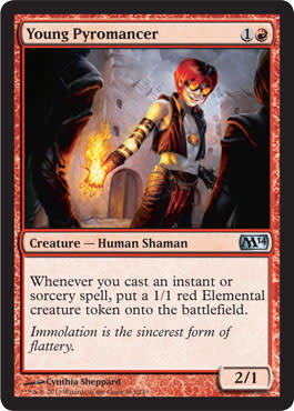
It’s a cheaper Goblin Bombardment, sure, and the obvious image is obvious on what is being flung.
Are goblins naturally combustible? Why is his mouth on fire? Did he eat some coals? Bizarre.
I like the aerial perspective; it just takes a minute to see what is going on. As viewers, we assume things are at eye level, starting at us, compared to a weird perspective change. I really like Trevor’s risks; they’re definitely making him stand out as ambitious. It’s not being able to work on Magic at a high level that’s difficult, it’s staying there. Not unlike our flying goblin here.

That escalated quickly. Uncle Owen and Aunt Beru just had their home destroyed with fire, and now the land itself is attacking. Seems not awesome.
I like hoser effects that bring new options for Commander. Randy Post loves making some creepy scenes, and yet, this doesn’t, really fit his MO. I like it; it’s reminiscent of the flowstone back in the day, of lava depicted earlier in Magic’s history. Randy isn’t ignorant to the olden times. I see what he did there.
Those are some lovely puffy clouds, too—almost an ironic peacefulness amid the destruction.
Action: Fire happened behind; fire going to happen soon again cause she’s in mid battle.
Mood: Furious-pissed, yet focused
Location: Unimportant but outdoors without fauna
Focus: Chandra making more fire
I guess?
What went wrong? What could’ve happened?
We expected some of the highly digitized artworks we’ve been seeing for months in Duels of the Planeswalkers and in marketing materials. It’s kind of a surprise to see a traditional artwork.
The location is just unknown. It’s not vital, but it surely helps.
The lighting is so perfect, so correct, that it actually detracts from the image. Go into a forge, and you’ll see similar colors. The problem is that by doing so, it eliminates detail and seems less perfect because imperfections can be hidden. This is a major branded image. We need to fully see the person. Is there a reason this image wasn’t used in promotions considering it is Chandra’s set? I have no clue, but it’s a non-zero answer.
I could spend a lot of time on this, but I won’t. She’s better than this. Both Winona and Chandra are.

“Dark creature” plus “light things all around creature” equals “art that isn’t looked at.”
“Oh, I’m casting dark creature; got it.”
That is one way to be memorable, but it doesn’t give a good path into the art.
There’s a lot of storytelling in this artwork: Figures are attacking him, he’s in a city, and he could be Rakdos. There’s no way to tell because the central focus is a nonfocus. It urges viewers to check another card art. That sucks for us, the viewers, who really, really care about the art, and for the artist, who won’t sell prints a much because the art isn’t recognizable.
I love the concept of bringing Dragon Whelp back. (Normal, hard-casted dragon whelps are way too strong for Limited—good lord.)
This is the opposite of the Cyclops Tyrant because I get a full focus and the other elements are minor.
Do you see a connective element to a lot of the Tolkien Hobbit imagery of Smaug? I sure do. A dark dragon cave with twinkling things will always mean Smaug’s lair first. It’s almost ingrained into geek memory of what a dragon’s lair should look like.
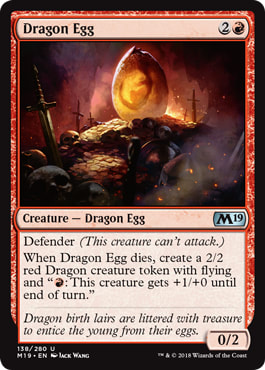
Swords are enormous next to those skulls! Look at how wide the blades are. Perhaps they’re broadswords? However, the swords do make really nice concentric circles starting from the bottom and rippling upward, only interrupted by the egg. That’s a nice visual cue. It’s a solid image by Jack.

At first glance, due to the colors, I really thought Paul Bonner did this. The man loves adding color into armor and rocks. I figure that’s a good thing for Alex, being compared to a folklore master.
What snapped me back is the weird perspective. The goblin should be smaller and farther back, don’t you think? The rocks on either side are messing with my sense of place. Either one is too far back or too far forward. Looking at the goblin and the right side of rocks is a bit odd to me. That scene composition isn’t quite perfect, but the effect is minimized, or could even be hidden, with a tighter crop. Keeping them as is shows the sheer size of the giant. (His hand is on the side of a rock face, compared to touching a nearby boulder.) The giant looks huge as a result and the goblin looks tiny—like faerie-small. Odd proportions of goblins do that, as we look for a human-shaped comparison to give us scale.
This tribe must have a pretty good stoneworker to have parapet walls.
I love the humor; the Foglios would be proud. A Monty Python connection is made.
I would love a cloud or two, but it’s not really needed for the scene.
Team #purple stands up again.
It’s a Limited bomb set in a very busy image with a strong Ravnica connection.
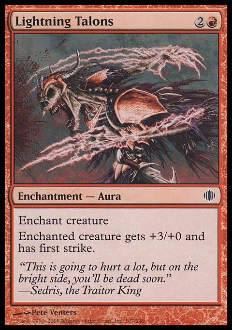
That’s about it. It’s very digital, almost masking over a layer of red on red to hammer home that it’s red. I think this could be pushed back just a little to see more of the figure engaging in a scene. I know the rule of thumb on Auras and Equipment is to zoom into them, showing the thing, but art like Umezawa's Jitte, the promo version, works just great for showing what it is.
In any case, it’s a decent, acceptable image.

Thank you, Adam Lee, for putting “maul” into its name. Those horns need, need a bashing name.
The face is just Jesper doing his thing, making cool monster faces.
The body is just a crazy-giant torso and shoulders that fade away into foreshortening with an absurdly long tail. At a distance, the tail still fills up the space. The thing has to be enormously long!
I wish I knew where this guy was located, as the waterfall should notify us, but it’s a core set, so a default mountain range is all that’s really needed, especially on a creature that will be played a lot.

Look at Wayne’s usage of pink. Remember it—it’s very much a signature color for him. We’ve seen it before.
What I love about Wayne’s work is the detail. He “gets mental about detail,” adding wear and tear on everything in an image. He really leaves nothing pristine. It’s why he is basically on retainer for Pathfinder, illustrating most of their world. His style is unique in that it has its own visual cues and intricacies. I love Wayne’s work and hope to buy another original art from him soon. I hope he does a few more locations because his lands and quiet scenes are incredible. Yes, I know his jam is to have all the things moving all the places, but when given restraint, he totally fills in details that illuminate upon seeing the larger painted image. Check out his original art up close at the next convention; you won’t be disappointed.
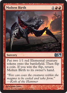
I really dislike this art. Jaime did a good job with it, but I’ve seen it before. It’s another warm-up monster sketch that I’ve seen thousands of times in DeviantArt portfolios. The scene is tilted to show . . . something dynamic, and the splitting is hard to see upon quickly looking. Is the elemental in the far background the other half? Compare it to another “split” card in Warren Weirding:

It’s a lot clearer what is happening. Sure, that was a more colorful set, but core sets aren’t limited to dark palates and colors.
There are other ways to show the concept, and Molten Birth just didn’t hit all the notes.
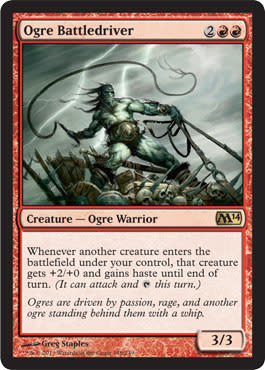
Greg didn’t, or wasn’t asked to, show another creature being whipped. I think that’s wise and very much implied by just showing a whip. That works and is flavorful and cleaner for a core-set image.
This image has an epic quality by the taut muscles and leaning-back “hero” we’re gazing upon. I like some humanoid races to have a variety of visual styles. Not all ogres need to be ugly, and all elves shouldn’t be beautiful. I’m happy to see that core sets showing a little more variety, possibly even foreshadowing into future sets on a visual style. Keep a look out when you see “oddities” like slightly deviated creatures. Usually, those are plants for the next block since our core sets turn over yearly.

Oh, it’s a protective cat? Which . . . temple . . . is it . . . guarding? Read Chandra’s novel The Purifying Fire to hear more about the plane of Regatha, where Chandra spent most of her time—“spent,” as in past tense. Flavor feels a bit odd, but the image is great. It’s a solid, fiery cat, probably able to be used on a variety of games from Duels of the Planeswalkers to a hundred other generic fantasy intellectual properties. I like seeing pumas in art; we never see them enough.

Scourge of Valkas by Lucas Graciano
Mmm, it’s an iconic dragon versus knight. Love it.
Some things to note:
- Lucas shows weathered skin by painting longer lines—clever.
- The wings appear pushed back because they don’t have as much detail.
- There are six horns. Because, why not? Looks cool.
- The water isn’t blue or green. If it were, it would fight the red coloring of the dragon quite a bit.
Muddying it up a bit really makes for an incredible background that isn’t obtrusive.
- Trevor Claxton
- Maciej Kuciara
- Chase Stone
- Daarken (Mike Lim)
- Lucas Graciano
- James Zapata
- Mathias Kollros
- Tyler Jacobson
- Slawomir Maniak
- Brad Rigney
- Ryan Barger
The effect is wonderful; I would love to see the imaginative sketches around this.
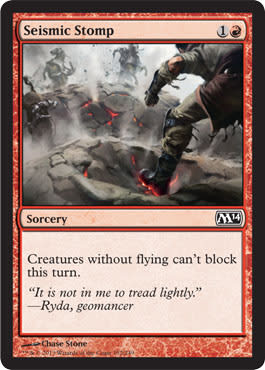
Our eyes immediately finish the motion, seeing the ripple effect and the enemies falling down. Showing a scene mid-action is really difficult without making it appear stiff or boring. This is a static image, yes, but the motion, the ripples, imply that you have to finish it in your mind. It’s the fifty-five-percent-completed image. If you go under fifty percent of the spell’s completion, it won’t want to continue in your mind, and it’s an awkward turtle. Get to right over the hump, and you see great motion, a great narrative that players will internally immediately finish.
Great work.
If David Bowie and Ramona Flowers had children, it’d be this guy.
Cynthia creates such amazing women in scenes. Please give her more. She shows everything from hyper-sexuality to subtle femininity.
I hope she writes about it on her blog soon. Is this a Rakdos party-goer? What’s up with the Chandra goggles and red wig? Is there a fire rave coming? Those Iggy Pop worn-out chest muscles tell what he’s into: partying and doing so hard. Every time I see worn muscles, I think Iggy Pop; he’s the Matthew McConaughey of my parents’ generation, never wearing a damn shirt.
Green
I mentioned how long the Marauding Maulhorn’s tail was previously, and you can see it here. It’s enormously long.
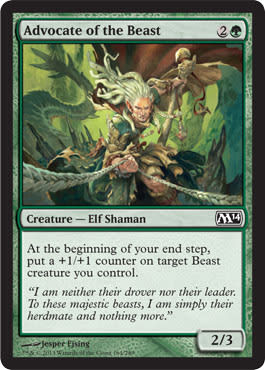
I see what they did there: the mechanics on both cards, one red and one green, allows one creature to be tamed, and in being tamed, becomes better each turn, probably due to a little elf driving him around. The ropes moving forward, as if we’re the beast, looking backward, are great. I love that concept. It takes an artist a little while to make those connective threads or an art director with time on his hands—usually both.
Side note: This cosplay will be hilarious.
Oh, I see; the face paint means Nissa. Got it. More planeswalker tie-ins in a core set? Awesome. Keep doing that. It’s incrediflavorful for Vorthos folk, allowing deeper meaning for enfranchised players. New players will struggle with the number of planeswalkers so quickly, which is why there are only five in this set, but a bunch are alluded to.
I’m not a huge fan of overly Photoshopped magical effects. Seeing this muted type is really different; it lets the figure breathe a little more, changing the figure-plus-magic-equals-spell equation into figure-plus-subtle-magic-equals-magical-figure. It works out really well here.
I’m impressed with Wesley; new artists tend to go overboard instead of using restraint. I like it.
I honestly thought that a MTGSalvation user added this as placeholder art when it was spoiled. I had a hard time believing it because the cat looks so painted over, so photo referenced, that it looks faked. Never mind the location, mood, action, focus, or color—those are all fine and make sense. Where’s the quality control here? This looks like a collage and not a complimentary one. There have been mixed media artworks in the past, absolutely, but they haven’t been blatantly garish. It’s not only the odd collage factor; if that were the case, it still wouldn’t have a solid light source. This one slipped through and isn’t Komarck’s normal quality.

Garruk, Caller of Beasts by Karl Kopinski

Garruk, Caller of Beasts by Steve Prescott
The full scene is a hundred times better than the cropped version, and I’m happy for that. I like seeing a scene, showing the planeswalker in action. It’s odd to see an eight-foot-tall planeswalker next to truly giant beasts. It’s among the hardest things about Garruk to show: his sheer size.
If you can suspend your disbelief to know that everything he touches is tiny, you can grasp Garruk a bit more. Karl’s large brushstrokes are hard to make out smaller identification items to show bulk, but his style fits with the planeswalker branding of being clear, tight, images. How he does this is to use smaller brushes on Garruk, showing more detail, and he then uses larger brushes to show a rougher, loose painting.
I’m biased to liking Garruk because I play green, but this is a great image. I wonder if it was submitted into Spectrum this past year. Jury’s still out on that.
Prescott’s “None More Black” version is cool, but I wish it were also a piece of a greater scene. Due to it being a promo, it’s a test. Do Magic players respond to “ghost” cards of a weird color scheme? They respond to limited amounts more so, but having planeswalker options will affect the Commander players wishing to acquire the obscure as much as possible. I am really hopeful to see the other planeswalkers, seeing how all black will affect their imagery.

Hunt the Weak by Raoul Vitale
Just let Raoul do his thing. Let him work it. “We need a beast, attacking and shib.” “Okay, got it.” Done!
He’s a very talented artist whom I have yet to see write about his cycle of Cluestones. I know many of them are already sold, but I’m told there’re a few left.
For this piece, look at it in high res, and remove the beast from the scene. It’s a well-composed landscape scene by itself! Why would you fill out everything on a minute scale? He’s a boss and wants to be proud of the entire painting, not just the figure. I want him to receive more cycles—I think he can do amazing things to show nuance because he cares intimately about each commission he undertakes. He even deviates from prompts to make more interesting scenes, such as his scene of Smaug with Bilbo.

Looking at Véronique’s webpage, it’s quite startling to see that the above image is hers. Magic’s brand urges artists, subconsciously or otherwise, to regress to a mean. It’s why collectors cry out, “All the art looks the same now!” Some of that is directed and leads to artist selection such as with Lorwyn block and Omar Rayyan. The rest of it is artists changing how they paint to “fit,” in their minds, Magic’s brand. Once you’re at the top of the mountain, there aren’t a lot of artists who climb into the clouds like Michael Whelan, Donato Giancola, and the like. Usually, people falter and fade away. There are always amazing youngsters coming up into the ranks. Don’t you think John Avon is aware of Noah Bradley’s landscapes or Todd Lockwood of Lucas Graciano’s dragons? C’mon now.
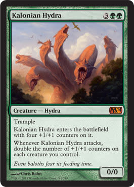
I’m sure Chris can paint great feet. Poor hydras only ever have headshots. Maybe they have nice calves. We’ll never know.
I just hope Chris keeps getting iconic monsters, of which hydras should be green’s iconic thing.
Anyone else wonder if he used a hand as reference? Perhaps a six-fingered man sat for reference.
Choosing Chris for tournament staples is just smart. His quality is high, he shows up to a lot of conventions and Grand Prix tournaments if asked, and is a friendly guy. Now, if we could just get Donato in for more artworks for staples, too. Oh, if only.

Kalonian Tusker by Svetlin Velinov
I like Svetlin; he’s always up on posting high-res images. It’s super-hard to see the blood at card size. The trace amount of dark blood really jumps out at a larger size, but I understand how gratuitous gore doesn’t really have a place in a core set. It would be nice to see a little more, though.
I like the usage of motion with the white streaks, but they’d fall short without the blood spatter—if you had underbrush also torn up with a swing that could also reinforce the fact of moving. I think those soldiers are a bit stiff, but then again, I’d be crapping my pants, too, if I saw a fellow soldier basically slashed through.
Color on the tusker’s face is great. A lack of saturated, bright colors creates a dinosaur-esque feel without being cheesy. Though real dinosaurs had feathers and were crazy-bright, making this a little less cool.
Despite the flavor text making less sense because there is no battle map plan, I like the cartographer art concept. Hell, I own one of Donato’s Cartographer lithographs. I love maps and am working on an art gallery show on maps, and in this context, magical map help, a living augmented reality via Google Glass, is pretty cool.
The spires feel like old-school Magic artworks of Tempest. This is almost a quest to destroy . . . spires or something to stop a wizard’s plans, and the heroes need a quick way to do so. It’s great visual storytelling but a bit out of place of a visceral, surface deep core set. I hope ideas like this marinate for future Planechase planes’ art descriptions.
Ah, also, have you played Star Wars Battlefront? Perfect allusion. I’m sure an alterist has already sketched out ideas for CIS ships and robots on the ground for this card.

I see what you did there in making the leaf veins and the human veins sync up. Clever.
I’m sure MJ Scott is fired up at the high-waisted pants, knowing her preferences. It’s the central focus of the piece, clearly, but I can hear her yelling now. I can’t help but think Phyrexian influence every time I see veins bulging out in weird colors now after the Scars of Mirrodin block.
It’d be interesting to remove the card art and imagine this image in Legends of the Five Rings. It could fit the green-magic-as-nature-magic trope. It is a core set after all. Dan Scott: keeping it simple for you, stupid.

A high-res version is needed, stat!
I love me some seventeenth-century Dutch still-life paintings, and I would kill to see more of that in Magic. I see the berries and immediately think of the bounty right after the hunt. I wish Magic had the freedom to do just amazing still-life pieces more often. We see wizard workshops all the time; why not more common life like gathering eggs, chickens, and seeing wildlife like every wall in the 1800s farm kitchen?
As for Christine’s work here, it has a nice perspective and some great minimalist depictions of deer. I wonder how large the original actually is—probably huge. In any case, it’s a nice little landscape that would work quite well back in the day.

Mmm, there are some scale birds. That beast isn’t small.
Please commit this image to memory; this and Marauding Maulhorn are Jesper’s Art Style 101. It’s the type of fleshed-out, clear creature that would be in Dungeons & Dragons Monster Manuals back in the day when Pathfinder wasn’t annihilating D&D.
It’s an interesting color choice. If you change his blue skin to green, dark red, or a burnt orange, it all works within the context. I’d play around with Photoshop layers, but the rabbit hole would have Dr. Seuss combinations. This is a blue beast, and we don’t even bat an eye. Guess we’re used to it all by now.
Notice his small head and giant body. Making a smaller face immediately bulks up a creature, obviously, but making it look unique instead of like a Pokémon is a real challenge. Play around with it the next time you see a big ol’ monster. Scale up the head, and see how the image changes.

Too. Much. Shadow.
Shifting the perspective up or down from sketch stage would help this piece immensely. All y’all, take note: Notice how many pieces in his DeviantArt have different or unique perspectives—not many. He can make beasties, but showing multiple figures interacting in a scene isn’t his sweet spot. Can he do it? Sure, but as evidenced by this piece, at card size, it’s hard as hell to take in the entire image. Artists shouldn’t try for Easter eggs, to force a player to look closer in a core set. It’s nice, sure, but it’s the entry-level set of the year. Be clear, concise, and immediately understandable. The lighting works for the piece, but correct lighting only works if a scene is composed incredible well. Sorry, Johann, this commission wasn’t the best for you.
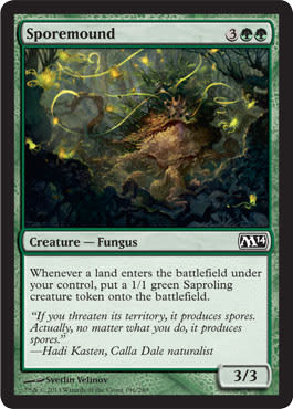
Well, if something begs to be busy, it’s saproling things. Swarming creatures should be totally full of life, of little token creatures. Great job on that.
I’m just gonna leave what it reminds me of: the spores in the GI Joe movie.

Screen captures from the G.I. Joe: The Movie, © Hasbro Inc.

Vastwood Hydra by Slawomir Maniak
Here, we see another hydra without feet. Seriously, let’s go all Alpha-old-school and get some Rock Hydra feet all up in here.
Maniak has a great sense of color and light in this piece; that’s true. Do they seem like tentacles at high-res? Oh yeah. The bumps on the neck give it an allusion to octopus suckers, moving “Greek hydra” to “anime monster.” It’s not a huge point, as hydras should be diverse, but it really, really sticks out due to the light source (a small campfire?) that focuses our eye to the visible body. I wish we’d see a little more of the hydra’s hair. I love creatures that aren’t supposed to have hair—really, I love any uncommon features being added in. I think those are great additions to unique monsters, giving depth to a specific creature in a specific area.
Let’s not add too much hair or we’ll get duck sirens/hydras:

Screen cap from DuckTales episode “Home Sweet Homer,” © Disney
Wow, is that a digital image. It totally looks like a game’s rendered screenshot, like in Maya.
It needs a little more dust to portray the full motion where a viewer will connect the dots into seeing which way it slithers. It’s a valiant attempt.
The shape of a backward question mark will be easy to register considering this card will be played in Limited a lot. I guess it has that going for it, which is nice.
I keep thinking this is a German fairytale creature, eating you up at night if you don’t help clean the house or suck your thumb. The giant head is made for children’s stories. The head is a third of the body!
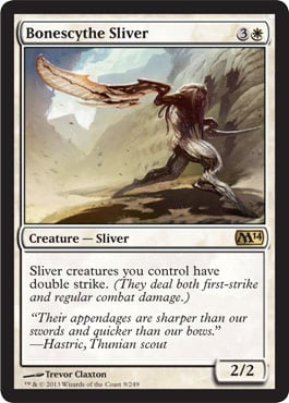
I know Chris Moeller receives some flak for illustrating a lot of random creatures and rarely any tournament staples or very expensive cards. I find the assertion untrue because he does; it’s just that he’s done so many cards—no one gets all planeswalkers or all rares. You get a smattering. This piece fits into his odder side of works he sometimes does and will be a comical piece for years.
That head.
So big.
Comical.

Woodborn Behemoth by Matt Stewart
Was this supposed to be a sliver?
No seriously. Look at it.
Nah.
Close, though.
Love the lighting behind. At high res, you can see the birds, showing its size. (Scale birds!)
I would’ve loved to see slivers become all elemental-esque or created from the landscape. Biscuits, that could’ve been fun.
As is, Matt did a great job with his loose brushwork. It reads, “compiled of trees,” really well.
Artifacts

More purple! Yes.
A skull pot in the woods? This feels so Cthulhu; love it!
I’m so happy Eric did the cycle. I love me some top-down, resonant, and clear designs. The core sets have really improved this in the past few years. I think tropes are great, down to the feet of the cauldron! There are very strong asymmetric faces; I love the deviations to make it unique! Corbels in cathedrals often have similar weird faces on them.
Add some slight purple to scale birds, and you have an M14-sized creature.
Just a little while ago, Ryan Pancoast was breaking into big-time illustrations with some amazing landscapes. His wild-flower Plains is now a staple land—very resonant and memorable.
Some of his oil painting and figural work are just incredible. He’s now a staple in Spectrum’s annual book.
Remember how I said changing perspective, leaning things back, and lowering the camera will make things larger? It’s used seamlessly here. He even integrated the lean-back with larger feet than head. There are entire tutorials for that. If you sketch on a forty-five-degree table, you’ll have to correct perspective from literally sitting over the image. Use the free transform tool in Photoshop to correct it by pushing the bottom two corners outward and painting it to fit the scene.
Great work, Ryan. I hope to God that Jarvis gave you some silly-awesome epic landscapes.

Haunted Plate Mail by Izzy
We have here utterly impeccable armor lighting and rendering by Izzy.
Why is it so strong?
Search DeviantArt for plate armor.
It’s just a hot-damn mess of people who aren’t studying light, shadow, or color. They haven’t read Gurney’s seminal books on the subject.
I worked at the Higgins Museum in Worchester, MA for a summer, and I took hundreds of reference photos of armor. I even tried on a few suits and ran in them to prove ease of movement. Would I have had Instagram at the time, I’m sure there would be hipster-tinted videos.
Armor is hard-damn hard, to paint correctly.
Izzy has looked at extensive reference for this; you can tell from choosing a light source and by using different metals, he gives the armor some depth. Normal armor is pretty sterile, but as soon as you add color, such as with Knight Exemplar, you push a narrative. It’s why LEGO had knights who wore blue and green. Filigree is great to show gender. To show some character depth, add different-colored metals. Just don’t make the sword too small.

Elegant.
Precise.
Top-Down Design 101.
Great job on the sketch; I can see how it was a windmill-slam “yes.” It’s conceptually cool but not out of left field. Art descriptions are given pretty literal instructions, but even then, following one and executing on it is a different ballpark entirely.
This is conceptual, yes, but I’d like to think he was playing too much God of War, showing a stone chisel away at a titan, embedded into rock. (Theros preview! Obvi.)
Sometimes, simplicity is best, especially with long-term defined cards and concepts by players. Redoing Lightning Bolt would be a similar venture.

My flavor hat is on. An inferno isn’t 2 damage, you guys. It’s 6, 4, 3 or 8. Huh, I guess infernos aren’t tied to a number. Never mind then.
Planeswalker items are fantastic—not just for the flavorful addition to insert into the game—sure, that’s nice—but for the cosplay community. They want to see, up close, how items work. For example, could a future art exhibition have Magic “items” as sculptures on pedestals alongside their art? Can we have a Sensei's Divining Top be made or Chandra’s gauntlet or pieces from Ral Zarek or Liliana’s headdress? I love items and want more of these made.
I find it amazing that Primeval Bounty and Pyromancer's Gauntlet are made by the same artist. More amazing is that this artist’s online portfolio is totally different still! Her attention to detail could make some incredible still life pieces. I’m just saying, you guys.

Mark knows hyperrealism. He does it very, very well. He does seem to gravitate toward younger, attractive women. We all have preferences. Giving him some restraint allows him to really render out an image, giving it some life. Images like this work in Magic, in D&D, and in a variety of properties. It could be slush art, sure, but any fantasy generic trope used in a core set could be. (Slush art is art bought for an illustration but not used for a variety of reasons. The artist is still paid, and the piece is put into “slush” to be used at a later date, such as with Baneslayer Angel, which was originally going to be Ninth Edition’s Serra Angel.) When you see a singular artist in a set with no other illustrations, think, “slush art,” first.

Staff of the Death Magus, Staff of the Flame Magus, Staff of the Mind Magus, Staff of the Sun Magus, and Staff of the Wild Magus by Daniel Ljunggren
Mmm, I love cycles of one artist doing all the things. For the life of me, I cannot remember the life-gain artifacts from the past. I never played them, so they fade into obscurity.
As for the images, the Flame Magus’s door is a little wonky, but the overall effects of each of the rooms is really flavorfully fitting. I’ll have to think about how each room of a themed colored wizard impacts a setting and if each color would hold the staff differently. Great hands, though; I’m sure Donato would nod in approval.

Strionic Resonator by Noah Bradley
Noah loves him some Reddit. He posts there often, and I love seeing his process shots:

It’s super-digital, sure, but it is a very design- and mechanic-based card. It makes no sense in a vacuum. It repeats abilities, like a tuning fork, basically, so digital “magic” is very much needed.
It’s a solid image and one that I hope foils out really well because this will be a Commander staple for years!
It’s a great bottle design. But they’re not the best hands. That’s all I will say.

Encroaching Wastes by Noah Bradley
That is some pretty nice falling-apart land. Let’s bring some more melting lands all up in here.
Great ashy clouds there—very nicely done. HAVE TO ADD THEM IN! Love it.

There are two new Plains, two new Islands, two new Forests, two new Mountains, and two new Swamps. Two of each are by Andreas Rocha, and the others are by Jonas De Ro, and they’re great!
Yes, yes, yes, yes, yes, yes, yes, yes, yes, yes. All ten are hell-to-the-yes.
I love the new idea of keeping two art pieces and bringing in two new pieces in each core set. I really, really like that.
Rocha’s Forest with a hidden temple and his spiky mountains are, like, old-school Avon good. (P.S., I’m still looking for his Mirage purple mountain for me to buy. Just saying.)
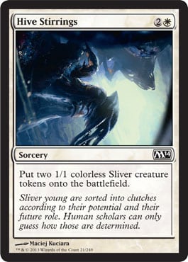
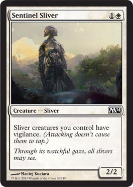
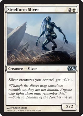
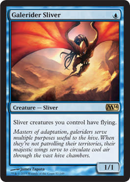
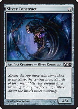
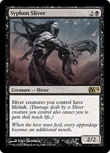
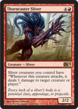
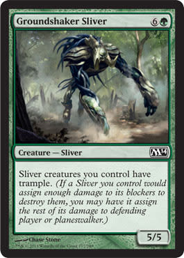
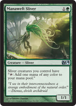
Slivers
These artist took the prompts for the slivers:
Eleven artists will have to endure angry fans, constant commentary on how they wished their artworks were more similar to the original ones. I feel for them because this will last for years. I disagree with the decision that was made, but I really am angry for the fallout these artists need to endure.
Not a single image is bad—they’re all solid images that depict what their art descriptions asked for. Artists were given a little freedom and made something very beautiful. Were we making a sci-fi game and needed a new race, these would be absolutely perfect. These will always feel like alterative artworks, fan art hailing from DeviantArt and that feeling of inadequacy, despite artists doing their duties fully.
This is a tragic case that doesn’t affect Timmy, Johnny, Spike, or Melvin. This is a Vorthos issue. Wizards, listen to us for once. If you need an outside flavor panel—a focus group not unlike playtesters—it’s not as though we at GatheringMagic alone couldn’t whip up a team in ten minutes. Perhaps with the recent changes to Creative, there might be some invitations and more solid plans worked with some community members. We can hope. If not for the consumers, think about the artists.
I’ll simply list them, just to help all you OCD fans:
 |  |  |
 |  |  |
 |  |  |
 |  |  |
 |  |  |
 |  |
The (Subjective) Top 5 of Magic 2014

Blood Bairn by Ryan Yee
View it high-res here.
Creepy children are the worst. I wanted the deviant, the terrifying anomaly to be in Dark Ascension, the flavor text set I last worked on. It’s the reason I love Interview with a Vampire so damn much: children vampires.
There’s an element of being forever changed, of innocence robbed and of terrible conclusions being made in this image. We all know that the kid who dissects and tortures animals has a ridiculously high chance of becoming a serial killer. Child vampires are what nightmares are made of.
The entire image is solid, from the visual storytelling to the dead figured behind the child, fully painted and fleshed out. Just a manic level of detail and hard work went into this piece. A+ work.

Path of Bravery by Chris Rahn
What can I say? This painting could be immediately shown in an Imaginative Realism art museum show . . . tomorrow. It encompasses the quality of a museum-quality piece, is resonant to our entire field, and encapsulates what a beginning must understand about Magic. We’re lucky that Chris still takes commissions. Justin Sweet’s dragons are gone already. It’ll be a sad day when Chris grows too large as well, but I’m happy to see him excel, bringing the entire field forward. A+ work.

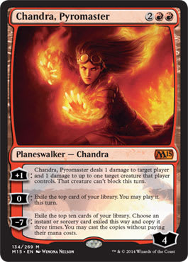
Chandra, Pyromaster by Winona Nelson
Wow, I just saw this image when Winona offered prints for ArtPACT’s IndieGOGO campaign, and I feel like a dumbass.
The painting is legitimately forty times better than it looks in the card frame, and for that, I feel sorry. The cropping minimized her legs, the dark place in the piece, which contrast with a frickin’ volcano. All of that is lost, leaving a very, very strong piece to be a hollow representation of the artist’s original intent.
This is the first time I feel very sad about a mere cropping. Even the colors are slightly different. It didn’t print as well as planned.
It’s a great piece, and I hope it makes it into Spectrum. I’m assuming it will. It’ll be a crime if it doesn’t. A+ work.

Dawnstrike Paladin by Tyler Jacobson
Tyler isn’t bad at this art thing. He was a finalist for his Ruric Thar, the Unbowed at Spectrum this past year, being one of the best illustrations of the entire year. This is my odd choice because of not what is simply depicted. While Tyler is a phenomenal artist, it’s not the image, but rather what the image could represent. We could have diptych images again, panoramas and polyptychs of figures and scenes. If Tyler gets two figures now, he can make a continuous painting again. That has gone away a bit more than we’d like as us Magic folk, especially the art-centric Vorthos, frickin’ loves to see. A great job by Tyler—really A+ work leading us in and out of the image, alluding to future design spaces.

Grim Return by Seb McKinnon
Not unlike Omar, Seb brings something very, very different to Magic. He comes from a different time, an era of illustrators, fairy tales, and illuminated manuscripts. There will be a time where he will shine, taking the brand of hyper-realism and pushing it into dream and emotion. His work feels like fine-art work from some niche gallery in a small part of town that is supported by patrons who love the style. Let’s hope we keep him rolling; he’s so close to illustrating that iconic card, that iconic image that will transcend and be part of Magic’s visual history forever. A+ work, and please don’t get hit by a bus; we all want to see more.
One Final Push for PACT

You should know about PACT: the Professional Artist Client Toolkit already.
You should drop $29 immediately to support them. It’s Indiegogo, so no money is taken unless they hit their goal. Do it for the Magic artists. It will improve future art; I guarantee it. You now have hours to support them. I pledged; won’t you join me in supporting our artists?
That’s it for Magic 2014 Core Set for new artwork.
There are so many new images, but the concepts are similar. Top-down designs are now standard fare. Immediately resonant, logical, and fantasy objects and creatures all make appearances, keeping the game approachable. Integrating Duels of the Planeswalkers as the pre-core set works even better.
Rapid changes in player opinion, like in the women-in-reasonable-armor groundswell of support, hit the core set first, and it really shows. The exact number isn’t solidified of how much midriff or thin tank tops are required, but rather being aware that chainmail bikinis are a long way from being out of the community.
New artists are making the veterans shake in the boots yet again. The level of art is raised every single year. We can’t have larger sets, so competition will only grow fiercer. You’d think Jeremy Jarvis would never pay for drinks at conventions because of it. One would think.
I’m now past slivers and just feel sadness for the artists. If slivers are an evergreen creature, showing up all the time, wounds will be created when an established artist is “stuck” with one. I’ll be watching social media, documenting them even more highly now.
Thanks for reading. It’s time for me to sleep.
- Mike


