Elspeth is Nemo in Nyx/Dreamland
Journey into Nyx is here, and Elspeth has found herself stuck between the gods, the humans, and her honor. Last we heard, Nyxborn creatures were leaving Little Nemo’s dreamworld and utterly smashing the hell out of the mortal folk on Theros—Nyx gators included.
What would be helpful is Godsend, Part I, the e-book by Jenna Helland. Wizards cannot entirely control e-publishing, so this book was actually released late. If you read the Planeswalker’s Guides, you’ll notice there’s about a half article on the storyline, with utter cliffs of content missing that are in the e-books. I’m okay with having to drop $2 to gain around a hundred twenty pages of amazing writing from Jenna Helland, but it annoys the crap out of me when it’s crazy-late. I’m sure these will be fixed, and despite the Part II Amazon date being decades in the future, it’s coming out in May according to creative designer Doug Beyer.
The storyline, as we know it, is as follows:
Elspeth arrives, tries to help current strife, and is blamed for Xenagos’s ascension. Ajani tracks down Elspeth. Elspeth finds Ajani hanging out with other leonin, who aren’t exactly cool with the whole god-worshipping thing. They’re basically redditors with weapons, considering they’re cats.

Solidarity of Heroes | Art by Eric Deschamps
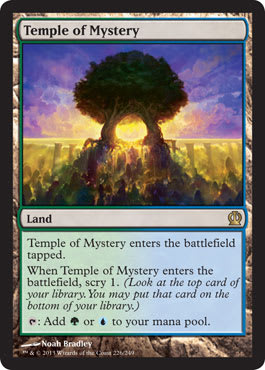
They then travel to the Temple of Mystery at the world's edge, at a cataract. This is a giant waterfall that separates Theros from the underworld—it’s the rivers that separate them. We really need an atlas, but that just isn’t going to happen. Maps don’t really happen anymore.
They are trying to communicate—commune—with Kruphix, God of Horizons to figure out how to undo Xenagos’s ascension, fix all the things, and enter Nyx.
 |  |
Basically, they want to enter dreamland, where gods reign and are located, kill Xenagos, and then peace out. Backing up a minute, Elspeth has Godsend, a weapon forged by Heliod, God of the Sun. He was furious and blamed her, but some prophecy said a sun’s champion would emerge, so he changed his view, after trying to kill her, forcing her into exile, but then forging her a weapon. Akin to Greek gods, they constantly change their minds, emotionally loving and hating things every five minutes.

Godsend | Art by Daniel Ljunggren
Back to the story . . . All we know thus far, until you read the e-book, is that this weapon fell from the sky, and Elspeth has already used it for whooping:

Deicide | Art by Jason Chan
The story is essentially over. Elspeth kills Xenagos, and the storyline of the e-books and cards are supposed to fill in the story. I suppose that is very theatric, knowing the ending, but watching the ninety-minute play to find out what happens in between. I guess I’m okay with that. It leaves a lot left out, but perhaps that’s a Vorthos duty—to be historians. God knows message boards love having to track down information.
The Set of Art, Overall
Here are some quick perceptions on the set’s visuals:
Shadow of the Colossus and God of War Had Offspring
Notice the tiny figure with the giant creature not entirely fitting into the frame nearly everywhere like Flamespeaker's Will? Deicide? Knowledge and Power? Mortal Obstinacy? Quarry Colossus? Rouse the Mob?
The list goes on and on. While neither game was explicitly mentioned, their influences in the genre are clear.
Yes, it’s mighty hard to illustrate size without using the same forced perspective image—trust me; I know—but the variety of imagery feels random without a storyline. We know a war is kind of happening, and then Elspeth is on a journey into Nyx, home of the gods and the mortal dreamland. We don’t really get to see a journey and we easily could’ve. Instead, we really see a potpourri of Nyx creatures, Nyx weapons, some things with Elspeth being snappy, and the Theros races. Visually, it’s all over the place. I haven’t deduced a flow from the set, and I felt as though it could’ve hit a theme of all “over war” or “war with a side story” fairly well—instead of showing the outcome with a bunch of other things.
“Planeswalkers” Everywhere
The Jace’s Eel, or branded person’s thing, feels pushed here. Whether it’s Elspeth kicking ass or a local druid doing so, characters are empowered in the art. I hope this becomes a Magic art trope. I think it’d be a really distinctive push. Magic used to have flavor text quotes from Jaya Ballard, Task Mage and other folk all over a set, but never Jaya Ballard’s spell or iconic race doing some spell as a strong visual theme. I think this theme of “group does something” is a great step.
Imagine if we’d instantly recognize a Boros spell just from an image. Ignoring the color schemes but just knowing, “Oh, it’s a Boros spell, so it’s either a flame thing or a life-gain thing,” within nanoseconds. By showing legendary generals doing a thing, it speeds up retention. Seeing the new Revoke Existence makes me very happy.
HD Hides Nothing
Beyond showing cosmetic surgery and dimples and requiring more makeup, high-definition depictions show that which is unseen. Apparently, Kruphix is a man—or, well, was.

Cropped image of Kruphix's Insight by Igor Kieryluk
Constellation = Flavor Text Killer
A lot of card art could really, really use some flavor text insight. Sure, many constellation cards had flavor, but it’s a quip and tells us very little about what is actually going on.
Banishing Light? Who is that, and what is he killing? Is this important?
Colossal Heroics? Who is pumping these soldiers to become huge? A god? Elspeth?
The Theriad?
Connecting to the last point, The Theriad is only mentioned three times in Journey into Nyx of the fifteen times it’s mentioned. I hope one day that the style guide—that only artists and freelance writers get to read—will be released, letting us know more about this epic and more about any symbolism it has on the art. I’m sure there are tie-ins—history tends to repeat itself, after all.
The Color Palette
I mentioned in my Born of the Gods art review that the general color schemes appeared to lighten up from Theros to Born of the Gods. They darkened a bit to Journey into Nyx, for obvious Nyx-related reasons.
Nods and Winks
I also saw the Dictate of Erebos being a nod to Hatred. It’s probably a stretch, but black has very few in-your-face images. Being the same mana cost isn’t lost on me.
The Top 10%
The set has 165 and 16 promotional cards for a total of 181 cards. The top 10% of artworks is 18 cards. The usual hard-hitters are here, with a few new folks that are really swinging for the fences to get a spot on the art director speed dial. It’s becoming an ever-shortening list of people.
There is no order below, as I find ranking “best” art to be subjective at best, but these really stood out for me as being interesting or of strong artistic merit.
I’ve already shown Solidarity of Heroes by Eric Deschamps above. Consider that the first of the eighteen as character-building moments for Magic—that and Eric just knows how to make armor. Also, how art-directed do you think this piece was due to the exact size differences needed? That’s canon building there for, well, ever. That’s tough to keep your artistic vision intact with such rigid borders. I like it. It’d make a great computer background!
And onto the rest!
Ajani, Mentor of Heroes by Aaron B. Miller

Look at the whole image and see how much better the image reads. Sorry, Aaron, the card frame hosed you.
I love the concept of wheat for showing white-mana plains. It connects Magic to a tangible thing—wheat—that has been placed in everything from Agricola and Settlers of Catan to being called different things, such as bread or corn with smaller gaming properties. When you see the actual Ajani, the entire placement of where he is was removed. Now, this isn’t new—Winona Nelson had this same issue with her Chandra art. With the context, the art really sings. Without it, Aaron has just a well-made image with great lighting—instead of an incredibly evocative Planeswalker that speaks to the entire Theros world.
This could so easily evoke Russell Crowe’s Maximus Decimus Meridius walking through the wheat fields, of a general armed in a peaceful area. Instead, the stupid card frame hides all of that, and we need to seek out Aaron’s high-resolution version to see it as it should be seen. I’m happy he’s active on social media so we can see his work. If you’re at Spectrum Live, see if he brings a large version of this as a print. It might be worth picking up.
Blinding Flare by Ev Shipard

Who the hell is Evan Shipard? Why does he go by Ev?
I was unable to find this image in high resolution, as he’s a new artist! This is his first Magic assignment, and while it’s easy to remember on a card, showing a dark figure with fire, the high resolution will show the minotaurs better. I’ll be sure to post it on Twitter when he posts it!
Here’s his website. When you see his site, look at his dragons. He has already been called up by the Dungeons and Dragons art directors, and he reminds me of Justin Sweet or maybe even Chris Rahn with how he makes the wings blurred. I’m sure he has some boom-booms coming down the pipeline! Any concept artist as talented as he will do well in Magic.

Colossal Heroics by Seb McKinnon

I’m utterly enamored by Seb’s work.
Look at the water.
His Eidolon of Blossoms just breathes life into the Nyxborn creatures. It’s not just the black, semi-opaque bits that show the Nyx. It’s the lightness of the brush, not unlike Rebecca Guay or Thomas Cole. Some lofty praise, but remove the giants in this green instant, and you have a nineteenth-century painting, probably right before Van Gogh and in the Hudson River School movement. It was a cool time. If you’re ever in a museum, look for the Hudson River School stuff. It straight-up looks like Magic landscapes, especially when it has Mount Vesuvius erupting.
Gluttonous Cyclops by Steve Prescott

I miss Phil and Kaja Foglio’s humor.
Thank God we have Steve to give us some levity. He also paints traditionally, which only adds to his appeal. That cyclops is just stuffing his face like he’s playing chubby bunny against a fellow giant standing in front of him. Love it.
Hall of Triumph by Ryan Yee

Ryan is good at the arts.
Painting on the wall of Elspeth? A fresco? Nah, let’s make it a mosaic. Let’s make it way more difficult to create by adding figures that need to fit the space and not look out of place. I love that Elspeth’s legs are a little more solid, showing some weight, some armor, and some strength. She isn’t idealized and waify. Such yes.
You give this image to a dozen illustrators, and they will struggle like hell to get the perspective correct. I guarantee you that. Try even sketching this, and you’ll end up with a Jon Corpora barn.
This is another image that looks a bajillion times better without the card frame. If this doesn’t become a play mat, Wizards just missed a great opportunity. People do love Elspeth, and our veneration of this image is exactly its purpose!
Harvestguard Alseids by Igor Kieryluk

Yes. Please show more real-world things in Magic. I grew up on Grimm’s fairy tales, and there is a German explanation for everything, from why you should comb your hair to not sucking your thumb.
Using just agricultural elements to enrich the Magic world to a Roman field is awesome. I would love to see Native American wild rice, Pacific island coconuts, or plains alfalfa used. We can have a little realism in the game, right? Here, it’s added a bit obvious, it’s written into the art description—let’s be honest instead of saying, “Igor, show us the nymphs using a common agricultural crop being used.” In the future, I hope to see more of this.
King Macar, the Gold-Cursed by Greg Staples
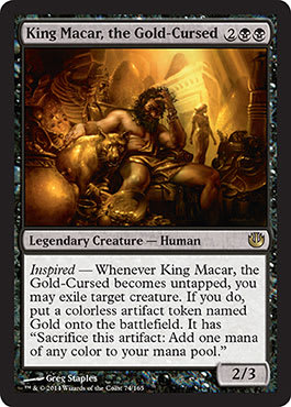
Compare this to the art on Gild.
Look at the sheer differences in depicting light on gold from Greg’s perspective. It’s just . . . more natural. This is where I generally like traditional stuff on matte board more than a digital painting, but that’s a preference. It’s a shame Greg isn’t more active online—this would be a great image full of Easter eggs, not unlike Steve Argyle’s Damia.
Launch the Fleet by Karl Kopinski

If there’s anyone who knows how to make an army, it’s Karl.
He worked for Games Workshop, showing space marines by the thousands attacking all kinds of beasties. This looks like a matte painting made for a movie, right out of Ralph McQuarrie’s hand to illustrate a scene for a clueless movie director.
I love the separation of spaces here. The sky doesn’t overlap with the boats, and the soldiers have their space separated from both, with only a few soldiers breaking into the foreground to shoot the movement of our eyes back into the center of the piece. It creates a rather calming, harmonious piece. Great work!
This is another image that would be incredible on a play mat. If Wizards doesn’t make one through UltraPro, I’d be shocked to not see some, ahem, self-made ones pop up at tournaments.
Nightmarish End by Willian Murai

Christ, Ashiok the Planeswalker is terrifying.
This art needs no examination.
Just look at it.
Feel it.
Imagine this were a Call of Cthulhu product. It’d also work there, even with the oversized, horrifying hands, you know?
I hope the cosplay community really grabs onto Ashiok. This image gives the back!
Pharika, God of Affliction by Peter Mohrbacher

Peter works by sketching the image on paper and then finishing it digitally. His sketch sold for $250, really showing how strong this image is to the community.
I love the lightness of the clouds, which is damn hard in Photoshop to do compared to oil paint. I mean, it’s among the things that is considerably harder. The bowl’s white “paint” confused me the first time I looked at it, wondering if Peter had switched to actual paint. Nope, it’s just damn well made. Kudos to him.
I also like how the Nyx element doesn’t overwhelm the figure. It should be a minor aspect, not all over the figure yelling at us.
Reviving Melody by Cynthia Sheppard

A woman sings a melody for her husband, who died in war, to remember and follow to come back from the dead. This image depicts an ageless love that not even death and the gods can stop.
It’s utterly beautiful and a strong contender for one of the best images in Magic I’ve ever seen. I used to analyze art historical images in college, finding symbolism and meaning. This looks like one of those images we scoured for hours.
War created beauty from is tragedy, and we are lucky to live in the twenty-first century with first-world problems instead of writing longwinded romantic poetry, vows that actually matter, and courtship with meaning.
Want to propose to your girlfriend?
Is she out of your league?
“Sing to me forever, and I will cheat death to be with you every day.”
I want to exhibit this in an art exhibition to show why fantasy art has meaning, purpose, and value. Our community needs images like this.
Sage of Hours by Matt Stewart

I’m so happy Trick Jarrett, our former editor here at Gathering Magic, made this image an Arcana subject on the mothership.
I saw the Antikythera and am happy additional real objects made it onto cards. It’s a busy piece, but Matt paints traditionally. Someone can actually buy this artwork. Thank God it’s not a legendary creature or it’d be mega-bucks.
His belt looks a little strange, but hey, it works for him. You see how fabulous that purple is or how many hours it took to weave jewelry into his beard? He stops time, so he has time to look amazing. His level of swag is impeccable.
Satyr Grovedancer by Jason Engle

I like cards that just fit into Magic with a few added bits.
For example, there’s this image.
We have dozens of Overrun/Garruk's Horde–type images with a bunch of different beasties all running toward the viewer. This image slows down that onslaught with a fully fluid character, memorizing the forest, to dance for Nylea, God of the Hunt.
Yup, that’s a world-building effort in one image. Green god? Check. Dancing for the god? You bet. Showing a very clunky design mechanic by only showing a dancer? They went there. A beautiful image, full of fluidity that will be overlooked by nearly every Magic player since it’s a common made for Limited play? Sadly, yes.
This is what Kor Spiritdancer should’ve looked like: actually dancing. Notice the twisting torso and the torque via the bellybutton shift. Ayup, that’s well done.
Scourge of Fleets by Steven Belledin

Belledin is a wizard, lover of Jaws, and an amazing writer. He wrote about this piece on his blog. Read it.
The high-resolution image does indeed show the birds taking off of the boat, as well as the eye on the giant kraken.
The waterline is amazing. Cripes.
Tidbit: The playtest name was Deluge Kraken.
Obviously, the original painting is already sold.
Thassa's Ire by Chris Rahn

See the oars coming off the boat? The transparent green water hiding a drowning sailor? The light coming through the water? The soft white into blue into green water transitions? The whipped sail?
Chris isn’t that old of an artist. He keeps improving, and just the water in this image is incredible.
Remove Thassa, and you have a museum-quality painting depicting the Iliad or something of the sort. Thassa keeps it in Magic. You don’t have to paint dragons or Llanowar elves to become a Magic artist. Just paint incredible things, and the art directors will keep work coming your way.
Wildfire Cerberus by Slawomir Maniak

Again, this is another image that integrates the classical field into a depiction. We don’t need giant magical spells hurled at us in every spell, and every creature doesn’t need to be in mid-strike. Some restraint to let the setting breathe feels right in this set. I care about the creature in the environment instead of just, “Oh, this is a Nyxborn thing,” or, “Yup, those be fighting humans with Greek hats on.”
The creative team built a world, so the artists might as well use it. Thanks, art directors, for letting us see more of it.
Worst Fears by Eric Deschamps

This reminds me of Venser teleporting into the heart of the Phyrexian situation in the online web comics. Beasties all around in both cases, but with Elspeth, she’s going to utterly kill everything. This is one of the storyline images, showing her entering Nyx, her being greeted by unsavory folks, and the second before she goes all Neo from The Matrix, flying and annihilating everything. You bet the Sun’s Champion just did her -2 ability and will be still swinging.
Her story here would be an incredible comic, as it lends itself to a short story form. Thankfully, we have the e-books to tell it. A pop-up book would also be nice to tell this exact image, but that’s Kickstarter land of Evan Erwin and Magical Christmasland.
It’s a lovely usage of a muted palette.
Finally, I’d like to give a quick shout out to the cats at artofmtg.com for providing high-resolution images. They really do a great job gathering images. Give them some page hits!
Mike