Conspiracy is the newest early summer set to come out, following Modern Masters, Planechase 2012 Edition, and Archenemy as June-release special sets. Wizards finally understands that investing in prebuilt decks of terrible to merely try a new format isn’t what players want, but rather, multiplayer formats that increase the chance for high rewards in the form of opened packs is the ideal. From a company perspective, shouldn’t players want cards to be easier to obtain? Logically, that would be reasonable to assume, but logic is stupid. That’s what the Living Card Game (LCG) model states as well—allowing players to receive all the things in one purchase—but the problem is that once you’ve purchased a prebuilt Planechase—or whatever—deck, you stop buying the product. You have what you need, and the gimmick to introduce a format is largely forgotten. While I love playing Commander Planechase, I certainly don’t feel that Planechase cards are in any way valuable.
I like the alternate artworks as driving forces, and I feel this is the first set that reprinted alternate-art cards to finally add serious value to the weird, pimp-my-card players who want Japanese foils of popular Legacy cards. I also like how odd many of these artworks are from composition to color palette cohesiveness. There are so many really odd arrangements with new artists just throwing daggers at your face to see how you react. It’s not lost on me that they used their normal set’s worth of six art directors for this set: Jeremy Jarvis, Dawn Murin, Matt Cavotta, Lisa Hanson, Matt Adelsperger, and Ryan Sansaver.
Finally, why not talk about the new-art versions of judge foils finally hitting normal sets?! Because they aren’t new. They’re known. Relax, and enjoy the new new, not the remixes.
Ding!
That’s it.
Wait, what . . . the hell . . . is this place? It’s Dack Fayden’s home world. He’s the comic-book Planeswalker made famous by IDW Comics.
Fiora isn’t a normal Magical town. It has a secret of cogworks and puzzles.
You’re a Planeswalker with a helper boy . . .


If you take steampunk and subtract the hard-to-believe parts and remove mana, you have a city and world inhabited by Professor Layton—of which, by the way, the first in the series—and the Curious Village—is one of the greatest puzzle games I’ve ever played. I love allusions and little tie-ins to popular games. While Mark Rosewater’s Plants vs. Zombies card didn’t really fit the world, as it was flavorful but kitschy, I feel, if anyone—I mean anyone—saw this tie in, that person deserves more than a few peanuts. I always say, “If you remove the border, does the art still have something to say?” If Professor Layton determines a point of time, I’m happy to see the allusion.
Onto art!
Brago's Representative by Anthony Palumbo

This looks like it came right out of Kamigawa block. I first thought Portal Three Kingdoms, but the art style was off. There is something about a guy in a tent with a pair of folks with him that speaks to those blocks of Magic rather well. It’s a pretty easy composition that will change a bit with the high resolution. What’s the box in front of him? Is it a box? What’s in the box?! Some sort of hopper for votes? A pedestal? At card size, that’s rather important to know or it’s just “some guy” with a pair of soldiers, which could be anything.
Council Guardian by Volkan Baga

I really want to see Volkan’s other two sketches here he turned into Wizards. I remember having to commission “guards” that basically flanked a door, shown below. Ameen Naksewee did a great job making an interesting door for the guards to stand by, but it’s a door with two dudes nonetheless. The art description in either case can be very open ended, but artists will also give you some pretty strong stiffness if an art director lets them. You can then make it work, changing the focus to the setting—such as the door—or start fresh.
Volkan chose to move away from the door and gave us an amazing-looking shield to make an otherwise-normal guard into a more regal, royal guard. Star Wars gave the Imperial Guard red masks and robes, oddly echoing Boba Fett but distinguishing them as different and better.
Also interesting is the scale difference. In an art description, did this start out as being a giant or did playtesting with the development team need a bigger dude to balance the set? The two foreground characters don’t really seem integrated. I see some meddling in this piece, as though someone were fiddling with Photoshop to make it work.
Volkan studied under Donato Giancola, the living master, and this set really allowed Volkan to stretch. He did great work here. I hope from his efforts that he illustrates more commanders and legendary creatures. His style of manic detail will work fantastically for those commissions.
 |  |
Council's Judgment by Kev Walker
 |  |
I wrote down a few options for how this art description could’ve been written. I immediately thought of pointing fingers, which is a bad suggestion, as you’ll see nothing except Phoenix Wright, Ace Attorney–looking figures pointing at evil things. I also thought this could be Mel Gibson feeling with Jews as “bad guys” pointing out a messiah to be martyred. Exiling is a pretty wide-open visual cue, so I like the white light showing some semblance of divinity, removing something utterly. I also thought of Harry Potter, having inquisitors bringing a prisoner from Azkaban for trial, exiling folks in real time. These sorts of scenes are ingrained into our cultural depictions, so art directors need to be very prudent in choosing the right sketch for a final artwork.
I’m not a fan of white spell bursts, as Magic’s visual iconography now reads that as an Innistrad geist. (Ghosts were called geists in Innistrad. They used the German word.) It works, but there’s just a little overlap with other visual cues in Magic. Kev doesn’t have high-resolution artworks available to see, so, sadly, we can’t really look closer.
Custodi Soulbinders by Karla Ortiz
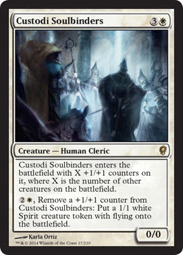
Custodi? Really?
I see the King Brago connection to take advantage of where Conspiracy is taking place that works well. I would love to see Karla make every legendary woman available in the game, but I understand she has to have other commissions from time to time. It’s always wiser to have artists continue a pair or trio of artworks that are tied to a single place. It’s just easier for consistency to use the same artist.
The crop is a little weird cutting King Brago slightly out of the frame. It forces a double focal point for viewers.
Custodi Squire by Alex Horley-Ortandelli

Is it a spiritual cleric? Or is it a spiritual religious guide? So, it’s essentially an angel without wings. Man, having no prior examples in a well-established game is so difficult to make. Make one wrong step, and you cross into a well-established trope. I do love the idea of what a nonwinged angel is called in Magic. Magic angels aren’t necessarily all clerics with spells, but I think this design space could be one of those Mark Rosewater Tumblr questions in the future.
As for the art, I like the ethereal qualities Alex can bring in his artworks by working traditionally. The cropping to fit the image into the box is utterly perfect, and while the swords a little large for the image with its skewing smaller, the figure is just wonderful. It could use a little more clothes, as it could be an example for years to come, but the allusion to a figure is just so implied that you miss the clear legs without the high-resolution image. I like the yellowing on the columns and the subtle makeup on the woman’s face. This would be an incredible original art to own.
Kor Chant by Yohnn Schepacz

This is a reprinted card with new art. Yohann is still new to Magic, with Renowned Weaver being his first card for the game. I like where this reprint is going. His first Magic card had a great composition, forcing your focus to the character first and then to the setting. This image, Kor Chant, in contrast, has a few conflicting figures. The card is focusing on the Kor folks, with what they’re doing being represented by a dead creature. It’s effectively a fight spell in white, but the chant appears to be more of a ritual as opposed to a combat trick in the thick of battle. Yes, art need not be a perfect match of design and function of card to mechanic, but in his case, it’s just a little off on what the card actually does. It feels confused, as the sketch chosen was chosen as “close enough” instead of chosen because, “Ayup, that’s the card, do that real nice like.”
Rousing of Souls by Jeff Simpson
 |  |
Oooh, I like this.
It looks like the Bassae Frieze! Sure, there are a ton of these in antiquity, but I thought of this one first.

I’d love if this were just zoomed out like ten to fifteen percent, just to give some perspective on where this site is. Is this a mausoleum with sculptures of the dead inside? Do the local folks venerate the dead by depicting them!? So much gooey flavor here!
Jeff’s first two images in Magic were Dissolve and Bloodcrazed Hoplite, and both were adequate. Maybe he got nervous during them because comparing them to Rousing of Souls here confirms that Simpson should be in Magic. I see some color-palette choices that echo Jesper Ejsing or Paul Bonner. It’s lightly and colorful, but not quite Steve Prescott. It’s a very good usage of color there. I think the shadows could’ve been given another week of love, but they look great on the top-left area of the image. I wish this were in actual paint because this would be an incredible painting to buy and place alongside any of Chuck Lukacs’s work.
This is meticulous work from a well-established concept artist. I hope he keeps receiving work!
Rout by Igor Kieryluk

It’s great subject matter, isn’t it?
That’s a pretty neat Elesh Norn. Really well done.
I love recent nostalgia in this game so much.
But man, those Photoshop streaks are distracting. They’re right in the center of the work, too, framed perfectly so you can’t ignore them. Some magic-looking effect is needed, but it really does cheapen the effect in a close-up view.
It’s a personal choice, but there are so many ways this could be done differently. I do love after-the-effect images, as they exude more power than lightning bolts going all over the place.
Soulcatcher by Julie Dillon

Holy Lorwyn colors batman. We haven’t seen this type of color in years. I’m seeing a pattern of the new artists—like Julie Dillon here—in that they’re taking risks, deviating from the Magic style norm. Conspiracy is a shakeup. I get it.
I love the staff; it’s just a great way to show a deviation from Ron Spencer’s original Soulcatcher artwork. I haven’t found much on Julie Dillon online, but I’m sure we will soon. It looks traditional, and if she keeps with the lightness of paint like rk post back in the day, she’ll do quite well with Magic. If nothing else, on birds and winged things, she’ll have work for years!
Unquestioned Authority by Zoltan Boros

Is that a Homunculus hanging out on the stairs nearby? Will this reprinted card make my Uril, the Miststalker deck? You bet.
A ton of pieces in this set are reprints of the Bird themes of the Odyssey block, and having a little more flavor squeezed in really looks nice.
I always feel that Zoltan has a Ravnican feel to his art, from figures and clothing to the little inclusions he adds. I feel for him, as he doesn’t have his partner artist Gabor Szikszai anymore. The Eastern European style is what Ravnica was based on, and both Gabor and Zoltan are from that region.
I love the focus of this piece despite many figures looking in different directions. A spot of light—a ray, in fact—really pushes your eye to the middle and has a slight homage to MC Escher’s “Relativity” piece. Great figures, good focus, fantastic clothing choices, and a strong movement between figures make this a pretty stellar piece. Amazing work!
Academy Elite by Volkan Baga

There is a difference between Muzzio, a legendary creature that will see play in more than format, and a bulk rare in the form of Academy Elite. While both cards are impressive in their own right, Academy Elite is a group of people, needing more space and a zoom out to fit all the details.
I like the idea of them as a choir. It’s odd to see inventors/blue wizards who are apprentices need a whole group to do a larger mechanic. Stranger is why thirteen are depicted instead of, say, four to five characters. As humans in Magic are “shown” as 1/1 to 3/3, generally, wouldn’t having thirteen of them would imply that you’d have that many spells already used in the game? Otherwise, this would visually connect to a 13/13.
I like the choir concept, with the “choir” being not necessarily singing people in robes, but rather the priests or clerics who were in the choir area of the church. (It’s #6 on the map below.) This is where the phrase “preaching to the choir” comes from.
This image of Academy Elite is just a group of the closest wizards—or the closest priests—located in an area designated for them, and that area is something that looks like a medieval choir. It’s a well-researched piece, and since Volant is German, I’m sure he’s giving us a nod and a wink about his area.


The choir stalls, screen and lectern of Albi Cathedral, France.
Breakthrough by Raymond Swanland
 |  |
THAT MOVEMENT THO!
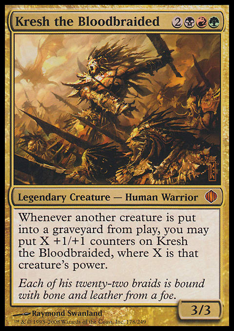
Man, Raymond really uses line work to push your eye all around the painting. Wayne Reynolds does this, too, but he uses more rectangular forms like broader swords and distinct, stylized robes. For Raymond, look at the original Shards of Alara Kresh the Bloodbraided. The thick lines created a frantic, chaotic feeling to the piece. That is what I feel Breakthrough is trying to give us. A blue wizard is controlling the chaotic elements of nature. It’s odd to me that a blue wizard, by controlling the weather, gains insight from it. Is he harnessing nature and chaos and gaining insight from it? Does that feel blue to you? I’d guess, from the subject matter, that it’s green or red. Add a red sky at night with some lightning in the sky, and you have a red wizard. Add more cyclones and/or more hurricane-feeling imagery, and you have a green druid. Essentially, the water makes it blue.
That water in this piece almost makes it feel like Mirrodin. It’s not similar to the Quicksilver Sea, but the rocky crags with crashing water could be very fitting there, almost like the black-aligned towers of the Mephidross. Granted, we also didn’t get to see much of Nephalia, the U/B-aligned area of Innistrad either.
The blue-magic effect created via Photoshop isn’t as distracting here. Perhaps the nature of harnessing the elements needs a little more magical, semi-transparent brushstrokes. It isn’t real after all. Without magic being shown, the art itself doesn’t tell us much. I don’t read this as drawing cards with a drawback without the magic being shown.
Marchesa's Emissary by Tyler Jacobson
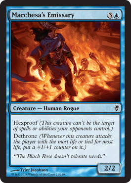
This art is so weird. Two figures are interacting on a weird Y in the frame that I just can’t wrap my head around for perspective. It appears that the floor is actually melting and the emissary is floating above the flame.
Per flavor guidelines, why is a rogue impervious to fire? I mean, the fire looks Chris Rahn–great, all digitally done well, but it’s just kind of confusing. I think it’s the cape that’s pushing my eye out of place.
Love the hat. Wish we could see more of it. Would make for a helluva cool cosplay.
Marchesa's Infiltrator by Lucas Graciano

A friend asked me about this piece, asking me, “What do you think of it?” I said I liked it. We both agreed that while Lucas can make some amazing work, he also is aware of it. I like an artist with a strong sense of personal value and an ability to sell original paintings for actual food money.
In this piece, the painted rose on the jacket is just the icing for a strong sense of perspective to give us: the mouse watching the thief make his escape. This is a storytelling artwork, one we don’t see all that much anymore from art descriptions. Now, if this were a scene in a book with Jace or a minor scene wherein something happens with Liliana on the ledge above, the cost would be all the dollars.
It’s a solid piece. Look at the high resolution, and check out all the little brushwork details, such as the lighting of the stone above his head down to the soft, cloth greens and yellows. I’m not sure who the person is who would really want this original art, but it’s a beauty, no doubt about it.
Misdirection by Mathias Kollros

The main figure: Great
The side figure: Not so great
The craftsmanship: Great
The mechanic visualized: Not so great
This is a serious spell in the Vintage format that will see play literally forever. Mathias is a masterful artist and should be easily be able to be given a long-standing, amazing card that will drive traffic to his artist table at conventions. So why is it a yes-but-no piece? Well, it’s hard to say, but I’d guess the sketch looked all right but translating a redirecting spell into the final image didn’t quite work out. Was the wrong sketch chosen? I’ll vote for that.
Right now, I see an amazingly dressed character with a weird head/neck tilt, a cropped lightning thing that looks quickly made, and a secondary character whose action isn’t clear. Did the orc—or is it a human?—cast a spell to be redirected? Was this another piece made to look like Misdirection when it came in for another artwork? Is this a slush artwork made to fit this purpose? You, reader, look at the high-resolution image, and say to me this isn’t awkward. Give it even ten seconds. Go ahead.
(F.Y.I., slush art is art submitted in the past and wasn’t used on the final card because of a development playtesting change, because the final art didn’t work, or because of a variety of other reasons, and it was set aside for future use.)
This artwork just doesn’t work for me in this instance. Sorry.
He’ll make something badass soon. Check out his deviantART page, and check out the Warhammer 40k stuff he’s made, or even his promo Eater of Hope. It’s . . . silly-awesome.
Muzzio, Visionary Architect by Volkan Baga

I’ve talked of this piece extensively in a trope discussion two weeks ago. It’s a masterpiece artwork. It’s the best art in the set, not close. Nothing else needs to be said about it. Grade: A+.
I’d love to know the art director for this piece. That person should submit this to all the art books—all the books.
It’s also being handled by my boy Mark Aronowitz at Mark’s Comics. Google him. He’s handling a lot of artists who are looking to sell their original sketches, some commission, and original art. He’s good people, and I fully hope you contact him if you see a Baga you’re interested in.
Plea for Power by John Severin Brassell

Fellow Eagle Scout, I salute you. This is a super-cool image. The composition is really strong, but it forces you to look at the center figure as though it’s the Shadow of the Colossus beginning.
See that the city in the background subtlety noted with brushstrokes? Those hats tho! I love a lot of fancy-hat variety, not feeling the need to lean on the style guide. See the minor banner flags on the side? See the light V vs. the inverted shadowed figures in seats? These are some really intentionally smart decisions by John.
This could work in like a dozen TCGs and calmly, very unassumingly, is very put together. This is great work for someone who really dissects the artworks made.
Split Decision by Robbie Trevino

Robbie was picked up for his drapery and angels in midair work with flow, but man, he can really do shiny metal. I feel that he could be picked up for The Room 3 if the amazing iPad game makes a third version.
This is strange usage of the mechanic, don’t you think? So, a hand will be cut off, either copying or countering a spell that isn’t yours.
Conceptually, this isn’t such a clear-cut, midbattle spell, but rather, a representative image.
Why include the guy to the side obviously cutting a hand if it isn’t “real” then?
Wind Dancer by Cynthia Sheppard

I had been going through a tough time for months prior to working on this, both with my work and my life in general, and was starting to give up on myself. The painting depicts a faerie character reaching out to the viewer over turbulent waters, offering safety, or a way out- in a sense, that's exactly what I was looking for at the time. The creation of the painting itself is what jolted me out of that bad period, and another literal interpretation of something I was going through, that paved the way for more recent pieces like Learning to Leave. “ —Cynthia Sheppard
 Stop reading, and look at this damn fairy. You should feel bad because you cannot make this with ten thousand hours and Jesus on your side.
I remember when people were all fired up when Rebecca Guay stopped receiving (or accepting) Magic commissions. I will feel that way when Cynthia eventually outgrows Magic. At this pace, we won’t have her for long. She’s making absurdly high-quality work that is in the category of the fine art term Imaginative Realism. When I stop writing at Gathering Magic one day and instead curate art exhibitions, she will be receiving a call from me. I hope she knows that now.
Bite of the Black Rose by Franz Vohwinkel

Huh, there’s Scourgemark and Vial of Poison, and now this pops in.
What’s up with Franz not doing landscapes anymore? I miss his work on landscapes. Maybe he was bumped out by concept artists from video-game companies coming in like hotcakes.
I love the addition of food and wine just out of reach. The character Marchesa is poisoning, and she’s doing it now. That’s a great little additions by Franz. See the fingernails that look dipped in poison, wine, blood, or oil? I love that little, subtle detail. It’s good work by Franz, and it’s a hard image to produce in that it has something interesting happen with mere hands.
I bet the art description didn’t have much besides the hands with a clause saying, “Perhaps some food or things on the table.” So, with so little to work with, I assume, he did a lot. Great work.
Drakestown Forgotten by Steve Prescott

Oh, Steve, this is just delightfully weird. I keep thinking the central character is a well from a distance and the macabre humor is just what we’ve been needing. Humor is so focused on goblins that other characters rarely portray the comical oddness. The background giant building is a fun little addition to set it in Fiora compared to Ravnica.
Nice jeans. Ha!
I also love the Reddit investigation by OnyxTemplar:

Speculating is fun.
Grudge Keeper by Ryan Barger

Yup, Ryan has worked in Warhammer 40k, so he knows how to make an eerie scribe. I like the perspective considering that we’re the visitor to him and atop a lectern. I always loved medieval, highly ornate speaking areas. Perhaps that’s my upbringing in Black Forest Germany speaking.
This “keeper” is in the apse of what seemingly is a church, and I have no idea why he would be there. I look forward to hearing more about Fiora and why a zombie wizard is in a church (or commandeered church) location.

Christchurch Place, Dublin 8, Ireland
Reign of the Pit by Evan Shipard
 |  |
Is that a post-ritual demon emerging out of a summoning circle? Is that another new artist, hitting his second set of Magic ever? Is purple making another emergence in card art? Am I impressed by his work?
You. Bet.
There’s a painterly quality about his softness of strokes that almost feels like watercolor. Look at the Demon token’s head, and compare it to the light purples in the sorcery directly next to the white out of the demon. That softness is when a digital artist really uses a light touch on the Wacom tablet with low opacity at the right amount. I wish I could explain it better. Ask a digital artist to emulate a watercolor in person sometime, and he or she will show you.
This is a good piece. M15 is tomorrow. I fully expect Evan to have a piece in there. He went from acceptable to good . . . Let’s see him get to great.
Tyrant's Choice by Daarken

I know, this piece was technically spoiled with Vintage Masters first, but it’s a Conspiracy mechanic.
It’s impressive to see Darrken show water displacement and edges that definitely feel more traditional than digital. What gives it away as digital is the underwater highlights and lit edges. It doesn’t “pop” as much on a traditional medium. Ugh, I hate using “pop” as a descriptor, but whatcha going to do?
It’s a weird usage of two bars in the middle of the scene, placing us right there. Magic doesn’t normally place us in scenes much, showing the hands of the spell we are casting, but it seems to have done so more lately. Innistrad was an entire block of us as the viewer, being there with the humans, and this set continues that tradition.
Victimize by Craig J. Spearing

This is just a simple artwork, but it’s really nicely made to put us in the scene, as I just mentioned before. Craig did a great job making Putrid Leech as his first card, and he has a card with incredible upside for a Reanimation deck in Eternal formats. It feels like a Dungeons & Dragons image in that he was probably recruited for it originally and was then brought over to Magic. I mentioned six art directors worked on this set, and they aren’t all Magic-only ones . . . After looking at Putrid Leech more, I see more D&D storytelling than Magic scene. I’m cool with it, and I wish there were more crossover that was obvious, as there is with these pieces. All we need is an owlbear, and we’d have a good trifecta.
It’s a good piece of art that feels like Wizards.
Enraged Revolutionary by Drew Baker

You burn things, Trogdor. You burn them good.
Here’s another instance of an intentionally-non-Ravnica setting: bars with light shining through in a sewer.
Poor guy must have a pretty wicked hand of first-degree burns. He seems to care zero percent about keeping his hand upright. Good for his crazy ass. Thanks for giving us a view into this guy, Drew, simply by keeping the torch sideways. It’s subtle, but I see it. I’m sure the torch was included in the art description, but . . . he’s in a sewer and probably can’t see. If he loses that torch, he’s blind. Shouldn’t he be more careful with it? Am I using logic again? Sonofa.
Flowstone Blade by Allen Williams

Is this Allen Williams? The line-work master? Who used to go by LA Williams?
Wait, did he emulate digital art by crazy line work with digital enhancements for funzies?
Cripes. If the Tempest block were made today, the art would look something like this. That’s what nearly twenty years of art, style guides, and Photoshop improvements have done to card illustrations. I don’t look back and feel nostalgic. I think the tools at the time of creation create snapshots of the art, with some folks harkening back to more traditional creations or even collage still-lifes taken with cameras (yes, really). I’m happy to see artists who have been here such a long time that they “get” the feeling of the original art, as this is a reprint, and give it a modern update.
It’s also why Wizards saying, “We did everything and are out of options for Slivers,” pisses me off the more I think about it.
Grenzo's Cutthroat by Svetlin Velinov

The eyes are really beautiful here. Look at them close up here.
Notice the big nose, and realize that “Nozzo” was Grenzo’s original name. Grenzo is a bit too close to Krenko, another legendary Goblin with a similar prefix to other Goblins for my liking. “All goblins have similar names!” Man, that feels racist even writing that.
I have no idea why the figure has a spotlight on him, but at card size, it gives it a secondary focus that isn’t really needed, but meh, it shows really nice street reflections in the water, so it’ll seesaw out.
Again, this is another piece that feels more Renaissance-with-bars-covering-grates, placing it on Fiora instead of Ravnica.
Check out Krenko's Command to see the ground difference.

Grenzo's Rebuttal by Dave Kendall
 |  |
Well, that’s one way to show some boom-booms: dude walking away from inferno like a 1990s action movie. Tongue-in-cheek mode achieved. I think an arsonist or a pyrotechnics user fits super-well here. The exploding cart is a nice touch from Dave.
These pictures show up a lot and are best left to more established artists, as being tied to a sketch will create an image that I’ll guarantee has been made before. I hope all the art directors have really great search skills for the ten-thousand-or-more-piece archive or incredibly useful tags for finding them. I forget my keys on my desk all the time at work, so I can’t imagine having to remember every random red destruction spell to not have crossover, thus inciting angry players to become mad at me for “copying” older cards.
The token brings two things to mind for me:
- Dave Kendall really does make art that looks like Grixis. The color schemes alone do it!
- Broken fingers held in the air show agony, really, really well. Creepy!
Ignition Team by Karl Kopinski

After digging through piles of Warhammer artworks only to not find a high-resolution version of this image, I still don’t understand it.
So, the “team” is as large as the opponents’ land bases. So, the amount of mana you have access to determines the number of Goblins that will become available. I can spend mana to remove one of the +1/+1s, or a Goblin, to make a land into a large creature on my team or on an ally’s team. By doing so, I lose a Goblin.
So. Um.
Do I set one on fire, and in doing so “wake up” a land? Does it make it alive by the elemental nature of the terrain? Why is this red and not green? Was it, perhaps, a playtesting change?
Shouldn’t this blow up lands? Maybe that’s why ![]()
![]() , e.g. Stone Rain, is in the mechanic but was deemed too good. And then, goblins lighting buildings—or lands or whatever—on fire would make sense, as they would “ignite” and immolate themselves.
, e.g. Stone Rain, is in the mechanic but was deemed too good. And then, goblins lighting buildings—or lands or whatever—on fire would make sense, as they would “ignite” and immolate themselves.
Nice-looking goblins by Karl, as always. He’s reliable and can get ’er done as needed.
Scourge of the Throne by Michael Komarck

Big gears speak clock or steampunk land to me, and I’m not seeing any obnoxious top hats with monocles. You burn the shit out of that giant clock.
This a windmill-slam mythic rare that will be a fantastic Commander card for years, and frankly, it would be great for a reprint, too.
I love the slight blue flame coming from the dragon. I could easily see a copout to bright white, but the heat is all blue, baby. Komarck does, in fact, do traditional painting, and damn, it’s hard to tell. I think he cleans up a bit in Photoshop, but not much.
Treasonous Ogre by Randy Gallegos
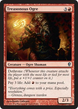
Our own Carlos Gutierrez spoiled this card. I love it.
Ugh, I want this in high resolution so bad. I’ll be talking about this on my Tumblr sometime soon, as I can’t really see the art. Randy knows I want this art; we’ll talk about it soon, but not here because Wizards printed it so dark—again.
Sad panda pass.
Elephant Guide by Tomasz Jedruszek

Rain elephant showing up for duty!
This is another instance of what-the-hell Conspiracy:
- Is that a human druid summoning the elephant?
- Where are they?
- What are those monolith-looking things?
- Is this an elephant graveyard?
There are so many questions I have of this piece.
One thing I don’t have questions of are the trees. Do they look nice? Yes, yes they do.
Exploration by Florian De Gesincourt

Who chose a new Magic artist to do a staple, Eternal-format-used card? In a game in which living master artists are taking cards, why choose someone who is untested?
That hand speaks for itself.
Everyone gets one pass.
Howling Wolf by Nils Hamm

Is that an Avacyn symbol on the tombstone? Isn’t . . . this . . . Fiora? What the hell?
I guess Howling Wolf didn’t make the final cut for Innistrad block. This is slush art, a reused piece of art for whatever reason.
I like Nils’s purples every set he comes out with now. I found them of-fputting at first because he loves green and purple—a lot. It’s his signature, and I have grown to see it. Weird.
Nature's Claim by Raoul Vitale

I play this card in my poison Legacy and Vintage deck. I love the color.
Raoul’s lands in person are much more vibrant than the cards portray. They really, really look nice without a mat, framed on a wall, with a thick frame to accompany them.
That lotus looks like something out of a play-mat commission, with almost a top–bottom difference in this painting. The trees appear to be comfortable for Raoul, almost as though they’re easy to create. The more pastel and light saturation the piece has, the more focus is gains, but also the more uniform in color—instead of subtly shaded—it becomes. Truly is a shame that giant paintings never show up that entirely well in a 2" × 2" card. Even the moss looks better in high resolution, you see?
Let us pray for Raoul to illustrate a land from every set until Mark Rosewater retires.
Predator's Howl by Ralph Horsley

This is another instance of “different ground = Fiora.” Artists followed that style guide well.
Ralph works traditionally, and notice how the wispy parts of the magical essence aren’t as clearly transparent as a Photoshop painter would have. Emulating a paintbrush is mighty difficult, especially when light is involved. I like it so much that I totally missed the soldier dead on the left, knocking to be let in through the door. Mechanic fed the art description that Ralph just easily added in just, you know, on a whim. No big deal. Just a pinch there. Say no more.
Wizards really pushed the taller buildings’ angles; they’re in nearly every depiction on the ground.
Ralph has been doing this a while. You need a green wolf, he’ll get you a green wolf doing a little something. Having dependable artists is such a delight for an art director. You have no idea how much easier it must be for a Wizards art director to have things made.
Provoke by Kev Walker

Fblthp from the card Totally Lost was a runaway hit in the Gatecrash set, and I’m happy to see Wizards going gangbusters on giving us what we want.
Kev is known for stripping away crap and showing the figure and only the pertinent information.
We see the effect of choosing someone to fight; I get that. We see boots as being, well, us and a fight that’s happening real quick here.
It’s a perfect mini-story that just needs a little more setting—or location really—to frame up exactly what’s happening here. A tie-in card could also do this, showing this from the other perspective to really portray that sweet, sweet flavor we all want.
More like this—yes. Such yes. Much yes.
Realm Seekers by Mike Sass

When the hell did Mike Sass start giving us such tight compositions with multiple figures placed so gingerly in a location such that I fully understand the entire set by simply looking at one of his cards?
Why is he not on a design push by Magic?
Official Soapbox
BRING IN MIKE SASS FOR A DESIGN PUSH. Please. He’s itching at something great, something deep. He has that Dungeons & Dragons mentality of showing a scene of a motley crew of adventurers, but he can do so without troping the hell out of them, or worse, placing a very iconic brand from one game and plopping them into Magic and expecting no one will notice.
Great work on the main guide’s clothing. I love the dome.
Selvala's Charge by Dan Scott

Those elephants almost look like Kev Walker’s, especially the background. More impressive is that Dan works digitally. He’s really getting into shifty territory here, fooling us.
I’m not loving the trees, but the composition from the sketch really shines through as being solidly different. It even reminds me of something Garruk would be on before Liliana turned him cursed and crazy.
Selvala's Enforcer by Jesper Ejsing

Boy do they love giving Jesper the beastmaster card. He literally just made this card in Advocate of the Beast.
I dig the rooftop view. Still feels Italian Renaissance feeling, but it doesn’t have overtly ornate buttresses, gargoyles, water spouts, or painted walls. (Maybe they were scrubbed out. It’s possible.)
The Elf is a solid piece in an otherwise very movement-oriented piece. I feel as though I’m going to fall off the roof but that the elf won’t. I suppose that is kind of the point. I wish Jesper could get all the beasts; he does do musculature incredibly well, but when someone is perfectly reliable to make a certain thing, such as a beastmaster, you give that person that assignment.
Squirrel Nest by Daniel Ljunggren
 |  |
STAHP.
Yes.
That is an amazing landscape, and Daniel should be doing more basic lands, but if he can make land WHILE something is in the foreground, why not have chocolate with your peanut butter? (Truth be told, when I saw the squirrel, I thought it was Steve Prescott’s.) It’ the color! It’s all digital, and he spent every minute working on this, knowing how popular it would be. Smart move, Daniel.
We have settings like the Squirrel Nest in Minnesota everywhere. Due to the glaciers coming through, we have roughly fourteen thousand lakes, and our rivers are just a mess because of it. One day, I’ll drive up to the Iron Range in northern Minnesota and take some pictures for y’all. Maybe Winona Nelson, who’s from Duluth, MN, just south of there, will be in town, and we’ll talk Minnesotan landscapes. Maybe one day.
The squirrel is cute—and open-ended for the alterist in your life. Smart move. Looks like someone learned something from rk post and Dan Scott how to make money hand over fist at conventions with doodles for $5 and $10 apiece.
Brago, King Eternal by Karla Ortiz

Yes, the ghost king/icy king will forever be appropriated to World of Warcraft with Arthas Menethil, Lich King and all that business. It’s a shame, really, as a lich king always has to be evil, and that a guiding lich or spirit could be benevolent isn’t really kosher with popular canon.
Karla is in that assign-her-a-legendary-creature-stat group. She makes really unique compositions to Magic, a serious feat with over ten thousand cards. Her step-by-step guide into making Teysa is still a masterful discussion into the artist process.
I just find her brushwork to shred away the unnecessary. Some of her big strokes on the gargoyle wings are intentional to push your eye left, to the King or right, and to the gargoyle. She left the background loose for the same reason. We gain a sense of place, but where the place is isn’t clear. This isn’t a church—unless it’s an old-school Romanesque one, which fights the Italian Renaissance/Baroque feel the rest of the set has. Though I like the idea that a dead king is in an older church, perhaps turned mausoleum or crypt. That’d be a nifty idea.
I can’t see anything past Arthus from World of Warcraft. I think it’s the spirit turquoise color Magic has perhaps gravitated toward. It looks like ice.
Dack Fayden by Eric Deschamps

Eric is a talented artist.
This is a good piece, yet I keep looking at Dack’s hips and legs, and something feels off. The silhouette is extended from his coat and shoulder pads such that I see that’s affecting the harmonious, normal, male figure.
There is some great leather lighting work all over this piece.
The stark lights and darks are really striking. They’re eye-catching without being distracting. The bright white doorway could stick out like a sore thumb if Dack weren’t centered almost saintly in the semi-circular door. I like that drawing of your eye to his face.
Notice the brick ground, and compare it to the rest of the set. This was commissioned way before anything else. They hadn’t tightened that aspect of the set yet, ya dig?
Yes, his red hand is odd. No, I don’t know why he has a red hand.
Dack's Duplicate by Karl Kopinski

Dack Fayden made a copy of himself that looks like a goblin—or is it a goblin that will look like him? Or is he controlling a wild shapeshifter? My head hurts. This looks like a spell, not a creature, and the potentially deep flavor doesn’t read as clearly without a tightly-zoomed-in image. Zoom this out ten percent, and it’s utterly a spell. As it states, it’s just another weird composition.
It’s nice-looking goblin with some awesome white hair on his head.
Is Dack wearing a mask?
Deathreap Ritual by Steve Argyle
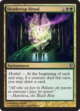
Man, that shows up dark in print. I held one, and I really felt for Steve.
You can do everything right on your end and end up with a life-gain common (that no one plays) or printing just nerfs your handiwork (as it appears here) or the foiling process makes it look all odd.
Luckily, this will be a highly played Commander card for years to come, meaning Steve will add another card to sign in the future. Fortunately, this will only be a one-card-signing, as compared to play sets.
When the high resolution comes out on Steve’s website, we will be able to see Steve’s manic attention to detail at eight hundred percent. Who are the three figures? You know he painted them. What’s behind the ritual area? You know it’s rendered.
It’s a unique-looking piece, but it just can’t be seen other than the recognition from across the table that it’s roughly a diamond.
Decimate by Zoltan Boros

GRUUL SMASH MEAN GRUUL BIG SMASH!
While I’ve ever-loved Decimate blowing up four things equaling one-tenth of your deck, the art hasn’t shown what the word means yet. I’m sure it will eventually, but I think Gruul smashing the crap out of things will get the point across. This just might be a slush artwork left over from Return to Ravnica block, as it doesn’t mechanically mean what the card does. This could just as well be a “Gruul surprise,” adding haste or trample to a creature or group of creatures.
In any case, Zoltan makes some nice architecture with figures that fit into the space. These are some very clear figures, showcasing that he’s made Magic cards for some time, realizing that being visible is often the most important thing to players, despite losing some realism outside the card frame.
I bet this would make a great canvas print if you’re a diehard Gruul fan. Do you like attacking with creatures? Do you like whipping them sideways to bash face? Get a print of this. It’s not as though Zoltan is hard to get in touch with . . .
Extract from Darkness by Dallas Williams

His first card, Omenspeaker, was really great. I wrote about it and told ere’body to look out for him. It was clean and did all the things right. This one is a huge step backward. It’s an interesting composition, with a wizard summoning in the background for a deeper level of understanding in the piece. But the depiction shown just isn’t that good. Let’s dive in to see why with Magic’s areas to describe a work to be made with some postulates:
Color: Blue/Black
Accomplished. It looks like a Dimir spell, adding blues and blacks. Nothing strange there.
Location: Near a Sewer Perhaps
Accomplished. Ayup.
Action: A Creature Coming from Out of the Sewers
Maybe it was only supposed to sit there. Maybe the other sketches were more difficult in terms of perspective.
Focus: The Creature Emerging
Nothing is emerging; it looks solid as a rock.
Mood: Foggy and Sneaky
Accomplished. It looks like that—sure.
It accomplishes the mechanic on the card and makes sense. It’s just the beast isn’t created all that well, and the focus is the creature, while the action is nonexistent.
Why is it blurred? Why isn’t it doing something besides just sitting there? Having the head twenty percent out of the tunnel with some turn of the neck, anything besides just sitting, would improve this image completely.
I’m sure I’ll receive an angry Twitter direct message from him, but frankly, at this point, he probably knows it isn’t perfect. This is Magic, not a random Kickstarter on zombies that includes dice-rolling to kill them in a car with a sawed-off shotgun. There are hundreds of people willing to make it in over the new artists. Turn in marginal work, and you should be booted. If Cyril Van Der Haegen wasn’t in poor health, he would be in this commission. Let that sink in, and then hustle harder. Christ.
Flamewright by Mathias Kollros
 |  |
Oooh, that iron window is damn nice.
This feels like a similar art description to Michael Komarck’s Veteran Swordsmith, but with a lot more intention on what’s around the figure. I really like this piece. I hope every Magic-playing blacksmith or glassmaker will buy a print of this image.
Also, this is a wonderful depiction of a strong, blue-collar woman. I hope play mats are made or, well, bootleg ones are made. People need to see this image. Blacksmiths shouldn’t just be men or dwarves.
I wonder what’s above the figure in the bleed area of the image. Boy do I love images that have things cropped out of them. There’s nothing more thrilling than seeing a roughly 2" × 2" image be an 18" × 24" image with a lot left out. It sure is fun.
Grenzo, Dungeon Warden by Lucas Graciano

Nozzo, Goblin Dungeonkeeper, I mean, Grenzo here is another of Lucas’s forays into legendary Commander creatures. (Nozzo was the internal name for him. Maybe not having a large enough nose was part of the change.)
I love the oversized hands, the weird spike epaulets on his shoulder, and the weird key/staff/halberd he’s holding. He’s a fun character, being a goblin of course. I love the lack of whimsy but some type of crazy sadist can be alluded to and works here. We know he’s crazy; look at him.
Great work by Lucas.
Magister of Worth by John Stanko

BUY JOHN’S WORK!
He works digitally but makes one “original” that he prints out on a canvas and then paints over, making it a singular “original” to sell. It’s an incredible idea, and they’re utterly beautiful and large in person. Were I an angel guy or gal, like Heather Dawn or hundreds of others, I’d e-mail him A.S.A.P. to obtain this.
Wings? On point.
Weird hat? Strange (like all of Conspiracy), but works.
Stained glass? You know it.
Draping? Makes sense.
Cosplay-worthy? Obvi.
Cube format staple? You bet.
We’ll see this artwork for years, and for good reason. This angel is masterful. This is what rare angels should look like.
Marchesa, the Black Rose by Matt Stewart
This is the type of card that Magali Villenvenue usually gets in the Fantasy Flight Games TCGs: a ton of close-up women with stuff going on in the background. For Magic, though, one has to get in line because, man, you have to find time when people like Matt are hustling this hard and are so reliable. He spoke about it briefly on his blog.

I just like how it looks like my friend Jess.
This is the art that confirms that Conspiracy is supposed to be rooted in Italian Renaissance, specifically the Baroque period of time. My favorite art history in college at the University of Minnesota was John Steyaert, and he taught that the Baroque period was the beginning of the intricate detailing of particularly woodwork. The next stage was the Rococo, the most elaborate, even gaudy embellishment.
Marchesa's Smuggler by Dan Scott

I love the roses all over the clothing of Marchesa’s folks in Conspiracy. It gives it a real-world grounding, which, to be honest, we hadn’t seen before. The creative team had some changes in the past year, and I didn’t see these real-life touches in the past. That comes from the art description. I see what you did there. I really do.
That’s a good-looking digital face by Dan, and there are some clean books out of the way and logical clothing choices. It’s a constrained artwork with some minor subtleties, such as light coming from the hidden passageway. Going from good to great means the little things are all there, with deeper levels the closer you look.
Selvala, Explorer Returned by Tyler Jacobson

Is it the Renaissance time period? You bet. Imagine a Russian diplomat or a frigidly cold character visiting an Italian city, changing clothes to fit in, but keeping his or her style. This is that image.
Damn you, Tyler and your ease of constructing a scene.
“Oh, I’m just going to put her in the middle of a city, in a park, all nice-like.”
It’s that easy. Damn him and his hustle. It’s just so damn hard adding buildings and figures in a scene that don’t interfere with the main focus, the character, without just slapping on a fifty-percent-opacity-layer in the background for “atmosphere.”
Then, he added a red-leafed tree. God damn him. It’s so good.
Spontaneous Combustion by Jason Rainville

This is another new artist. This is Jason’s second card after the promo Dragon Spawn of Thraxes from the Born of the Gods prerelease. Apparently, he likes the fire—or art directors respect his fire hustle.
I wish he weren’t so new. New artists tend to be overly cautious about posting new art on their blogs or websites. Post it early, and your career can end prematurely. So, for every one of these articles I write, I can never find high-resolution art.
I like the composition from a distance. It’s different enough to work quite well amid the hundreds of other boom-boom red spells. God knows, if you’re new, if you’re even close enough without overlapping a spell from 1998, you’re in good shape for the future.
Woodvine Elemental by Mike Bierek

Okay then.
It’s a skeleton elemental, or it sure looks like a skeleton that was painted over. I would love to see more wood-that-looks-like-bone concept. It’s a little tropey to look like kitschy fan art, but with a little art direction, it could really create a rather unique-looking green elemental creature for the future. Remember how I mentioned this set was setting a new tone? This character does that rather well.
While the foreground-left character looks oddly repainted, resized, and moved, I barely see it after the weird-looking new elemental.
Good dust kick-up. I like that.
Aether Searcher by James Paick
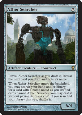 |  |
Robots are in Magic again. All right then. Conspiracy, you crazy.
Robot plus trees plus Renaissance buildings equals present-day science fair in Italian park.
I see a little Johnny Five in the helmet by James Paick—look! I can dig that nod and wink.
The revealed core is cool and a fun direction to take this artifact, especially as it balances the robot’s giant forearms and shoulders as appendages. If you squint, you can see a rough starting point of the Iron Giant. Man, there’s a lot in this little image. I didn’t expect Paick to hide all this stuff in there or expect myself to look this much into a park robot.
Agent of Acquisitions by Eytan Zana

WHAT IS GOING ON IN THE BACKGROUND?
No, seriously, is this a repossession agent? Does he take back stuff for debts? That’s a comical usage of Magic.
This is a beautiful set of armor. It has very methodically shortened limbs that portray strength. Something here reminds me of the University of Minnesota wrestling team. They’re all like 5’6” with no necks and short-limbed, but stronger than an ox.
I like the weathered look of the armor. With armor, either go ceremonial with filigree or wholly used, with dents, scuffs, and damage all over it. This is the latter, and it looks awesome.
Canal Dredger by John Avon

That’s a pretty small device for dredging anything, don’t you think? Maybe it’s efficient because real dredging machines are basically scooping behemoths.
John does shiny pretty damn well on metal using cloth on mixed media. He’s all digital now, but he keeps some of the mystique there when doing card art. Wood is the hardest thing to tell unless it’s high-resolution. Luckily, John and his agent Guy Coulson post it all on Facebook. Lucky for us!
It’s such a sad name for this little thing. Magic names one thing a drill, and immediately, it’s the anal driller. Poor Avon.
Coercive Portal by Yeong-Hao Han

Okay, ignoring the mechanic, I can dig that. Is this a slush artwork?
No, it’s not.
Notice the gears.
That places it on Fiora, for Conspiracy, right now. We have no idea where exactly this portal exists, but it’s hidden, and it’s probably turned on when people are near, not wheeled into a stronghold for Trojan Horse shenanigans.
Cogwork Grinder by Jasper Sandner
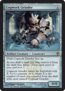
WHY CAN’T THESE CARDS HAVE FLAVOR TEXTS?
It’s so frickin’ annoying to not know what these things are for. Are they guards? Are they mad-scientist creations?
Yes, I know the Mothership of DailyMTG.com has more information on them, but in two years—literally two—no one will understand what the actual hell these things are when played in a Cube. I find that irritating for a Vorthos who wants to learn deeper flavor. This is a rare, and while artists have no idea the rarity of the card, the mechanic ties into the art zero percent.
I find the pillars a bit out of place, as the perspective pushes them really close to us as the viewer. Some of Jasper’s larger brushstrokes create a more Justin Sweet–esque form image, but they then go into strong detail.
Cogwork Librarian by Dan Scott

Muzzio spends his time at the library a lot and trains his apprentices there. Lucky for him, there are machines that speed up his researching because he doesn’t need to return the books.
This image is such a snapshot into Conspiracy. They used it as the preview image, and the steampunk feel, mixed with the Renaissance world-building efforts, align here most visibly. Notice that the librarian isn’t intricately etched, engraved, or covered in gild. It’s supposed to be functional, not ornate. Ornate means Rococo time period, which came much later. Imagine the time period when swords were used alongside crappily made guns. That’s the end of the Renaissance entirely. Once you hit Industrial Revolution, it’s too late. In order to get the functional elements of invention and cooperation that many of us can relate to, all you have to do is remove flints, gun power, and combustion.
Dan does a great job showing shiny metal. His lighting of showing light on books really makes it feel real. I see the lack of dust, and that illustrates the usefulness and commonality of cogwork machines in keeping things clean!
Cogwork Spy by Tomasz Jedruszek

What did we sorely lack from the Brothers’ War between Mishra and Urza? I would’ve loved to have seen multiple images of the war and flyovers of cities. I hope—Christ, I hope—that art directors will eventually give us back-in-time views in Planechase or a supplementary product. It would tie established players to newer players and give yet another reason to look at older cards again.
I’ll have to look at how the roofs align to historical cities. It feels more British than Italian in terms of the buildings, but we would have to see the style guide. If you look at Prague or Bratislava and then compare to Ravnica, there’s an almost incredible similarity. It’s on purpose, of course, as places need some types of real-world examples. Innistrad had a pseudo-Prussia feeling. Prussia was an area roughly from Northern Germany and stretching to Lithuania along the Northern Sea coast.
I like this image a lot. It speaks to possibilities in the future for tropes and art descriptions.
Also, those wings are mighty nice. If Hiccup would’ve had more time, he would’ve made something like these for his toothless dragon.
Cogwork Tracker by Alex Horley-Orlandelli
I went through this art look-see and finally realized the Professor Layton allusion with this image. It just looks so not Magic-branded. It really, really sticks out. The color schemes of buildings, the dust, and the softness around the main hound figure aren’t seen that much. I feel a Talisman-looking image, especially with the brightness of color and the rough-fantasy theme.
I think it’s the softness. Magic has gained more stark edges because of Photoshop. For example, in Photoshop, you can zoom into sixteen hundred percent and make any edge razor-sharp and “correct.” The problem is that human eyes don’t see like that. We see blurred edges—dust and grit get in the way, and our eyes assume lines even when they don’t exist. In painting, you can have some roughness, some splotches, and they act as anything. This piece is trying to do both, and frankly, it looks a little out of place in the entirety of the set. I hear the question, “WHY IS EVERYTHING DIGITAL NOW, MIKE!?” quite often. To fight that, I point out Terese Nielsen or someone like Alex who deviates a bit from the standard, plastic figures.
I like this piece. I just wish I knew the hound’s role. Do lots of families have these?
Deal Broker by Cliff Childs

This figure is awesome.
I see so very little color. The intricate details Cliff spent a lot of time on look a bit muddied, and even in higher resolution, they don’t really show up. The fact that it’s a mechanical trader doesn’t mean beauty, art, color, flowers, or really anything organic or full of life can’t be in the depiction. Does the art description ask for monochromatic colors? Did it explicitly ask for muted tones?
Add some color, and this moves closer to being a Muzzio image.
Fix the windows, and it becomes an incredible image.
Remember that it’s a rough Renaissance, even Baroque time period. They didn’t have perfectly clear glass. That’s fine in a fantasy game to do whatever you want, but seeing them with perfect squares looks hella out of place. I looked for a good half hour trying to find a good image of a Baroque manor or mansion. They only windows kept up are churches and rose windows, and giant lancet windows weren’t exactly common with citizens at the time. Looking at Muzzio’s image, there is no window—it’s only a window opening.
Lore Seeker by Jason Felix
 |  |
How is this different than Cogwork Librarian? I think that one is more humanlike and therefore able to do research, but they’re interchangeable without the card frame. This is ever a danger when writing art descriptions. So, Doug Beyer and Jenna Helland write these. I know that, but I don’t know who else writes them. It’s dangerous territory to have two figures with very similar depictions. I’m sure the sketch stage was very similar for both images.
This has great usage of lavender-colored light. That’s nice, as it reflects off the FRICKN’ METAL ROBE. What!? That’s some good attention to detail.
I love the Easter egg Ornithopter/winged creation that’s also in Muzzio’s depiction. I’m sure there was a sketch in the style guide by Richard Whitters.
Also, naming cards is really, really difficult.
Lurking Automaton by Yeong-Hao Han

Art description: Crustacean spider made of metal that can be a larger excavating machine or a protective sentry.
Or nah.
I love hazy backgrounds that aren’t just muddied browns or grays. Did he use green to give it a little mossy or rotten feel? I bet yes.
That’s a great-looking bone on it.
Whispergear Sneak by Jesper Ejsing
 |  |
Ah, it’s slush art for a Phyrexian something with a few changes. But, ah, this may not be a reused work. It does have a few non-Phyrexian bits, such as the magnifying glass, gears, cranks, and a gain. There are no organic bits included.
Either way, if you played during Scars of Mirrodin block, you see a little fun wink to the player. If you didn’t, this is just a cute little steampunk thing that embodies the aid-in-every-home idea. While this might be the CIA version of a little construct, I like it crossing into Magic. The game never has enough “logical” daily usages for Magic. I can’t imagine a red mage ever running out of hot water or a green druid ever having issues with his or her lawn.
Paliano, the High City by Adam Paquette

Make this totally clear, and you have a Final Fantasy–style implausible and laughable image.
Give it some atmosphere, clouds, mist, and fog? Have for yourself a great image. It feels just a little washed out because of it. It’s just too small an image at card size. Here? No problem. At two inches by three inches, it’s hard to see.
Talk about needing a helluva long stairway to make it up there. I feel many of the haves of Rio right now could definitely see the World Cup up in the High City of Paliano. While the have-nots, well, below would not.
Strange that a roughly Baroque time period is being pushed, yet Greek columns are holding up the city. It’s an obvious style-guide choice, but it definitely gives me a confused face.
I definitely get the nod and wink to Mercadia’s High Market. I love that connection.

Taking a quick and much-needed breather, let’s look at the art of the conspiracies. With it seems there’s one exception in Brago's Favor, shown below, all of the original artworks are vertical. They aren’t the normal card-size rectangles. They appear to be the size of Archenemy schemes. Directly below us is the Spectrum 18 inclusion Feed the Machine by Wayne Reynolds. I like the idea of these conspiracies being larger, but on a functional level, how would players draft them? They’d have to be store promotions.
I wonder if they were to be cards like Vanguard and a development or organized play change made them be switched at the last second.

Advantageous Proclamation by Izzy
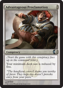

Wow, this looks like Warhammer Fantasy. I mean, it looks lifted out of Warhammer Invasion LCG. I mean, whoa.
See those blue stripes? The chair, cowl, and elaborate costuming here has some pretty established IP resonance out in geek world.
I wish there were a background; maybe it could be a decadent hall or courtly place of etiquette or a massive council meeting. There’s something about the court and the absurdity of proper society and snootiness that demands an audience in this piece!
The guy reminds me of Baron Vladimir Harkonnen from the 1984 Dune movie. The one with Sting! Something about fat guy yelling about a proclamation feels very tropey.
Backup Plan by David Palumbo

THIS IS A PAINTING OF A PAINTING!
LOOK AT THE FRAME!
This is like the original art to Archivist on my wall. It’s pretty rare to see paintings of paintings in Magic. I love the grittiness on the figure’s shoulder. It’s very painterly, with thick brushstrokes.
I want to see this high-resolution, full image so much. It’s obviously cropped, but curious I am to see what is outside the frame. Let’s come back to this soon on Twitter!
Brago's Favor by Karla Ortiz

There’s a shiny diamond in my hand! Look at it!
It’s a very nice set of bracers by Karla. It’s a nice usage of Photoshop to show the gemstone or jewel glitter in his hand.
What I’m fired up about is the art description. King Brago has some sort of enchantment or ability to make magic more able to be cast. He is helping to channel by holding some sort of magical gem or something.
Is this really the best choice? In a Baroque-looking set, adding steampunk to a Renaissance world filled with plots, intrigues, and poison, we see a king holding a jewel. Really. You can only work with what you get, and frankly, Karla didn’t get a lot here. “You made King Brago; have him holding a gem! Yeah!” That’s not the best art description.
Some options that could make some fun sketches:
- The King overlooking a duel in a mirrored hall
- The King showing “favor,” one of the most iconic visions you can make of papal iconography
- Showing a favored son or type of troop or encouragement toward Muzzio to find new inventions
Double Stroke by Christopher Moeller

This makes utterly no sense. So, a wizard or a Planeswalker can be given a doubling spell. The art shows a goblin being taking away.
Who assigned this art to this card? What was Moeller’s first card? What was the art that should’ve been here but was moved? Why doesn’t this make sense?
I’ll ask Christopher to learn what is going on here. The high-resolution version is very much needed to rectify my head-scratching.
It’s a good image and effectively shows a goblin being put into custody, but that’s not what the card does—literally at all.
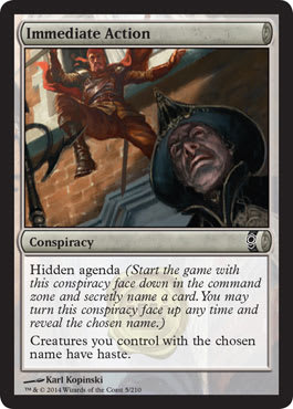
Immediate Action by Karl Kopinski

That uniform though! Cropping is the devil; it really is.
Does this fit the mechanic? Ayup. Is it good perspective to show, well, haste? Yes. Is that a nice hat? You bet. Can Karl Kopinski make anything you need as long as he has the time? Sure. Do we know why this isn’t a giant vertical rectangle? Not yet.
Iterative Analysis by Winona Nelson

Don’t they have cogwork librarians for this? Aren’t there Lore Seekers to do this for you?
It’s a fun little image. I have no idea why it was chopped down to being so boring. This is a wonderful image that does a lot of storytelling in a very tight space. Even without the mechanic, we can understand that this is an apprentice and he’s gaining something meaningful. He is literally gaining knowledge from the shelf. The story is there, and Winona just lined it up for us.
Strong perspective using space is very, very difficult without incredible distortion or, worse, an unbelievable space. She makes it look easy.

Muzzio's Preparations by Karl Kopinski

Damn it. Here’s another piece that has a lot of insight into a full cosplay wardrobe, cut short by a graphic-design card frame.
Kopinski’s male corset is a fun choice, especially when it’s made more functional and ornamental than to change a physical form, making him thinner. I do wonder how heavy this outfit is!
I feel these high-resolution images are snapshots I am not supposed to see. Each Magic card art image is meticulously chosen and forced into a frame. We never are able to see the full bleed, uncropped, giant image. We also surely don’t get to see oddities in the art game. It’s a fully institutional creation, and art directors aren’t exactly on Twitter yapping about weird things that come up. I wish they had time to give us Tumblr insight, but alas, only Doug Beyer’s blog will be able to give us those nuggets.

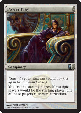
Power Play by Matt Stewart

C’mon.
This is a 16" × 24" image in oil on a board. Matt spoke briefly about this piece on his blog.
Is that marble with paint and raised ornamental additions to a staircase? Is this for a trading card game? What in the actual hell? Talk about swinging for the fences and telling grumbly artists why they aren’t in Magic.
Fellow Magic artist Lucas Graciano commented two words: “Sooo good!”
I agree, and nothing else needs to be said.
Secret Summoning by Lucas Graciano

Right after hearing from Lucas, here he is! He gave a little insight on his blog here.
Yeah, he’s good with the paint. The water looks really great. (I feel like the guy who reviews games and only comments on how the water looks. He’s been on Reddit a ton!)
Notice the oversized goblin heads. It gives them a playful look, just like how kids’ everything have oversized heads. While looking at the faces, I noticed the age on the Grenzo face. He’s old, and it looks awesome. Zoom into the image, and check it for yourself. Lucas uses very little paint to give the goblin a lot of character. Grenzo looks tired, obligated to bring out more goblins for an unseen master. It’s a very simple emotion shown with mindful effort, unseen for a lot of people. Always, always look at the high resolution!

Secrets of Paradise by Tyler Jacobson
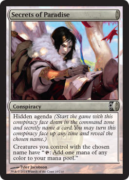
Okay, I see what you did there. Birds of Paradise is a card, and their feathers are able to create all the colors. Any creature can create mana with the usage of a pen. I love how animals can thus make mana by using a quill, such as a Shambleshark. Nailed it.
As for the image, we need that in high resolution. Is this elf in a tree? Are there other elves in the tree? Are they all writing? Are they scribes? Is it autumn? Do changing leaves signify something? Is she a traveler?
Great touch with the light peeking through the clouds on her face and arm. That’s a really smart idea. It’s logical, but I haven’t seen it before in this game. Everything is always in full light to show the faces of creatures. Art is straying away from a standard, but the card is damn small at 2" × 3".
Sentinel Dispatch by Adam Paquette
 |  |
Adam has for himself a very strong composition here. He gives some perspective that gears are big and that sentinels are living scrap heaps, using gears as his weapon. Maybe it’s some type of Oz ceremonial thing. The breastplate/skeleton ribcage is a nice touch. It gives it a macabre touch to the finely polished metal armor.
I assume this is under the city, showing tech that is fueled by giant gears . . . spurred by magic, I’m sure. Of course, it’s no Industrial Revolution, so there are no coal power plants. With a continual-motion machine, maybe it’s a red mage stoking his forge with magic by creating machines that are turning gears for hours to years without end.
Love the gear on the pathway art description. Energy fueled through the tracks creates a pretty smart system so that constructs can protect the greater workings underground. I’m not sure if the constructs can leave their tracks or they need to overlap like bubble hockey. I am happy I’m thinking about these things. It shows a deep thought process on functionality and world-building!
Bro, do you even Nintendo Base Wars?

Unexpected Potential by Izzy

Brago loves those horses, man. They’re totally his jam.
This is just like Brago's Favor. He’s helping folks out by making spells easier to cast. Wouldn’t this be a civic project leader? “Walls can be made easier!” Imagine Dungeons & Dragons back in the day, when bards used to play songs to encourage workers to move faster or aid in helping with a castle or cathedral being built. It was a comically unuseful skill in the actual D&D game, but in a real fantasy setting, if there were a way to ease any public-works project, it would be worth millions.
Brago can singlehandedly encourage innovation by himself. Showing the red fires of innovation, the “creative color” of Magic is a nice art-description touch.
I love Izzy’s elongated, even stylized horse face. While the sculpture is played with, the armor on King Brago is very geometric, almost analytical how it works together. It’s an interesting idea to have a calm, settled clothing option juxtaposed with the chaos of fire. It’s good balance that, unfortunately, was cropped largely out of the card. This art was not vertical as were many of the conspiracies. I’m not sure what that is.

Worldknit by Adam Paquette

Remember how I mentioned that we never see an overview of the area?
It appears that the buildings below became shanties in a slum, but the wilderness looks incredibly untouched. There’s no logging or any raw-material acquisition. There isn’t even a far-off gravel pit. It’s very green, untouched, and wild. It is an exemplary example of Selvala’s experience in the wild and the longing of hers to get back there.
The solid gargoyles are mighty nice. I would’ve loved to see more cogwork gargoyles/gardeners or something of that sort, showing a functional water spout and other thing beyond a fighting winged creature.
This is an utterly beautiful piece. There’s a reason Adam does so many basic lands. He’s worked hard.

Magister of Worth by rk post, Promo

There’s a rose window—it appears someone did his research. Most rose windows were always colored, but he knows that. They were probably to be distracting. Being uniformly cloaked in yellow light helps the divinity of the angel, you know?
Randy sure makes hair look flowy. His playmates have a lot of hair that looks rather natural with its movement. The two wings frame the image, pushing your eye to the angel as a figure and not just as the idea of an angel character. Focusing on intricate costuming or added details give the piece a little more fun for viewers. I’m sure Tumblr has already written a book on this image, comparing it to his past angels!
Upon first seeing this, I couldn’t stop looking at the position of the neck and face. The more I look at it, the more clean anatomy choices Randy made, such as things that could be real, a torso that feels more real all with strong stylization befitting an angel.

I’m now collapsed on the ground. I am dead. My hands hurt, and my marriage is stressed from thirty-seven pages worth of art. Cripes.
My dachshunds are licking my face, keeping me alive to type these final words.
Thanks for reading!
Buy a print of this art when you see the artists—they do appreciate it.
Best,
Mike
P.S. Alpha art pieces: They are out there. I’m mounting an art exhibition unrelated to the Alphas, but they’re on my short list. Help me find them.