


We’ve been working behind the scenes feverishly on this review, and we’re actually offering a Vorthos kit for those who are new to flavor and who wish to examine cards a little more throughout the duration of the review. Included in this kit is a magnifying glass to see brushstrokes (or the lack thereof); a special e-mail line with GatheringMagic to answer within four hours even the obscurest of Vorthosian queries; and a chance to win an iPad with the GatheringMagic beta app.
The only stipulation is that you have to find the link. Happy hunting, dedicated Vorthoses!
Back to the review!

![]()
![]() – Enchantment
– Enchantment
MJS: Oh, look: Oglor again!
ML: Frankenstein trope used again?
Sure, why not.
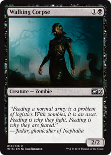
I want blue zombies to be a stronger tribe. I’ve been waiting to see more zombies in blue. Prior to this block, six mono-blue zombies existed with my favorite, Drowned.
ML: This card is an enabler for future decks. Can it be cheated out? Pretty sure if I am a planeswalker, I would cast this first, then cast away. You know: logically.
I love the use of the old haunted manor with scientific “things” on top to make it work. Steampunk fans must be crazy-excited for this card. Everything about this card makes sense to me. It’s top-down with borrowed trope in use, and it totally makes sense upon first sight to new players—despite how complex the combos this could create are.
Win.

![]()
![]() – 1/2 – Creature – Human Cleric
– 1/2 – Creature – Human Cleric
ML: It’s a black cleric—not an unknown concept—with a crooked dagger for sacrificing in order to summon something greater than himself. It just makes sense. Flavor text is fantastic and simple, which works well.
Two odd things: What are sticking out of the ground around the ritualistic circle?
This is a herald of sorts, needing some number of creatures and an effect to make something gigantic. Why aren’t the untapped creatures cultists? Is that not required?
Apparently not. The Skirsdag just need people to believe in their rituals for them to work. It’s a subtle distinction, but notable for Innistrad. Write that down.
MJS: Linnemann lays it down! I enjoy the texture of this piece. The peacocky colors are an interesting choice—very opulent and baroque for a black cleric. Apparently, you get more flamboyant as you move up the Skirsdag ranks. Or is this just one individual with a colorful fashion sense?
![]()
![]() – Planeswalker – Garruk
– Planeswalker – Garruk
 |  |
ML: I appreciate the missing article on the front card. “Garruk the Relentless” seems to be the obvious choice, but articles are dead. We’re not buying the iPhone; we’re buying iPhone. We’re not going to a church; we’re going to church. This subtle difference makes something larger than a thing and into a followed source. Can it become cultlike for products? Have you been in an Apple store?
I like how Deschamps made cursed Garruk a bit more entrancing to viewers so that they would want to flip him over. Nice.
MJS: Okay, time for Planeswalker: What Not to Wear. Garruk Relentless leather jacket? Fine. As long is the fur is faux, he won’t be at risk from PETA zombies. Veil-Cursed—now, he needs a talking-to about not stealing V-neck wrap-blouses from the women’s section to wear when he’s trying to strike fear into the hearts of femmes such as . . . Liliana.
![]()
![]()
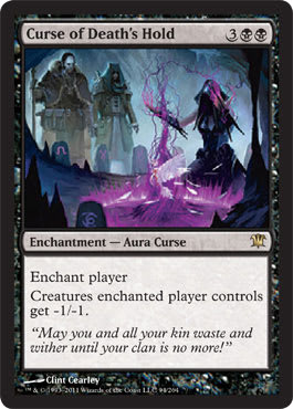
![]() – Enchantment – Aura Curse
– Enchantment – Aura Curse
ML: Mmmm, purple card art.
Clint did a great job with the open-ended art description.
I would recommend seeing this in high resolution on his DeviantArt page. Once you zoom in, you can see the little touches he added, like the paint on the left soldier’s face and the modesty the mage has in wearing a cover-up tank-top or the number “5” on one of the cairns. I love Easter eggs, and seeing what artists add to a composition really deepens the experience for me.
I will admit that it generally takes two to three seconds to understand that the two men are unaffected by the -1/-1 ability because they’re on your side rather than because they’re 2/2’s to begin with.
MJS: Love, love! Love the Manic Panic–purple spell and the descriptive quality the illustration has. Like something you’d see in an old fairy-tale book, and it’d make you want to learn to read so that you could know what’s going on. The costuming on the two watchers is epic—especially love the wolf’s-head shoulder pads on the guy on our right. A seriously great look for fall 2011. Now, is that a dove or a hen she’s cooking on her sacrifice-fire?
![]()
![]()
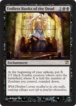
![]() – Enchantment
– Enchantment
ML: Arguably the best art in the set. I’m a super-big fan of “real” medieval art in this fantasy art setting. It’s a later-period stained-glass window, a fact which is made apparent by the painted glass, and I really, really wish this piece was painted because I would’ve already owned it and shown a Twitpic of it. Alas—it’s digital.
How can I tell? For future reference, you can’t easily blur paint. It can be done, sure, but it’s very, very difficult.
One of the best card names, too. When the art and name are so flavorful, flavor text isn’t even needed. It’s additive here, but the mechanic and art are the future of design that Rosewater has been thrilled to make.
MJS: My husband used to make stained-glass windows. He still knows how, so I think I’m going to tell him I want a recreation of this window for an anniversary gift, just to be a brat. Mike says it all here—it’s a wonderful, wonderful piece. Mad props to ye!
![]()
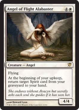
![]() – 4/4 – Creature – Angel
– 4/4 – Creature – Angel
MJS: The feeling in this piece gets me. It strikes me as the most emotional in the set. The impending despair is evident in the shadows; her vulnerability is articulated in that turn of her left wrist. The feathery wings look as soft and touchable as Charmin. And thank you, Howard Lyon, for the excellent gladiator sandals. They’ve been around as spring footwear for years now and, with their flat soles, are pretty practical. It’s a historically inspired fashion item that’s popped up and remained popular, and seeing them recognizably depicted on beautiful cards like this is Vorthos fun. I appreciate the card-to-real linkage in that I can actually go out and buy gladiator sandals next time I’m feeling angelic, and I can wear them on @Hackworth’s and my date night.
ML: Wow. This is such a strong piece where world-building inspired art direction to hit a new standard. The angel looks like no other angel in Magic’s history. It looks like an Innistrad angel—unique. The character focus is amazing.
The name is key to this card. It feels Victorian, but it isn’t. It’s Innistrad.
The flavor text is amazing. It shows the vulnerability of the angels and that even the hope of angels wanes in dark times. The emotion is so tightly knit.
Only one nitpick: How is the light distributed in a circular fashion? Is a flashlight shining on her? If it were a divine light, it would be from above, always as if from an angle. I know people need to see the card with lightened figures, but it’s only an A− from a strong A stamp.

![]()
![]() – 1/1 – Creature – Spirit Bird
– 1/1 – Creature – Spirit Bird
ML: Does this need flavor text? Yes, it does. It’s a ghostly bird. Why is the bird a ghost? Flavor text could explain this, because this card is a house.
This is where, as a Vorthos, I don’t understand how some cards that are so powerful aren’t Legendary. So this 2-mana card cast by a planeswalker can mill someone’s mind and then kill or neutralize a planeswalker in a few shots? Seems good.
The art is whimsical and ghostly—a changeup from the normally linear art. It reminds me of Harold McNeill. I miss Harold’s work. It pulled me into the game.
MJS: I don’t like two things about this card: The blues clash, and the name “Mindshrieker” makes me think some horror-inducing nine-headed dragon-drake is coming at me . . . and then there’s this 1/1 bird. He looks little in his picture, and kind of cute. Contradictory. But I think he might be good, so maybe it’s just a case of looks being deceiving.

![]()
![]()
![]() – Sorcery
– Sorcery
MJS: Should have been a woman. Specifically, a tiny virgin smiting all around her with just a look and the light of her faith.
ML: Oooh, that would have been nice.
Flavor text is spot-on, and the ability and art fit it perfectly. I don’t quite understand the name.
The name could correspond to the World of Warcraft spell—a square peg in a round hole. It fits, sure, but just needs that extra nudge. Wraths are iconic; their names are immediately recognized and are resonant.
Is the “divine” article of speech enough for a wrath to stand upon?
“Survival of the Purest,” in a horror set? Holy crap. Yes. Dear God, yes—that’s concise and powerful.
Survival of the Purest could’ve been the name had the green enchantment never been printed, and it would be top-down beautiful.
![]()
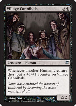
![]() – 2/2 – Creature – Human
– 2/2 – Creature – Human
MJS: I wish they’d made a card called “Village Idiot.”
ML: A track athlete I ran against in college, Xavier Carter, had a popular saying at the time—“Coach said we’re hungry; we came to eat!”—that he would yell before races. I thought he needed to put his $1 into the douchebag jar. I feel they’re just as hungry.
I want to know what province these humans are in. Of the four—Gavony, Kessig, Stensia, and Nephalia—which one is starving? I can’t jump into this card without that knowledge. There are six villages that equal 2/2. I struggle with that math fact, especially since I assume Kessig folk are sturdy and Stensians are sickly from being preyed on constantly by vampires, thus leaving Nephalia or Gavony in the poor region. Bud, you brought us as far as you could with the art. Jarvis, thanks for the direction for this perspective.
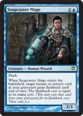
![]()
![]() – 2/1 – Creature – Human Wizard
– 2/1 – Creature – Human Wizard
MJS: Hooray for Mike Flores! Seriously, though, at least there’s one obviously non-Caucasian person in Innistrad. Just because it has a “European gothic” feel doesn’t mean there should be no black, Latino, Middle Eastern, or Asian folk around. Quite the opposite! Europe is rather colorful, from what I’ve heard.
ML: Or Tiago Chan. Oh, MJ.
Mr. Chan got a fantastic card for an invitational creation. I respect that it’s very playable. I know that the art pieces of Invitational champions have been, well, award-winners, but I suppose if you’re forced to depict someone, that really limits the composition.
I assume he’s Nephalian. Right? Right.
This isn’t a Vorthos card . . . .clearly.
MJS: Ok. Let me change that, Mike: “Oh, Tiago Chan, how did you escape from Kamigawa and have time to not only win the Invitational, but make it all the way to Innistrad, with a stop in between to get that darling Megaman X plasma blaster augmented to your arm?! I must know where you got it done—New Phyrexia?”
MJ: He’s been holding the “B” button a long time.

![]()
![]() – 3/2 – Creature – Human Soldier
– 3/2 – Creature – Human Soldier
MJS: Too pretty. Does that say enough? Who is this guy? Jake Gyllenhaal with a twig? No, I don’t want to see his trophy or the trophy room. It’s not a bad piece artistically; I just don’t like the interpretation of the character. I will give him that his face looks earnest, but righteous would have been better.
ML: Nice flavor text. Seriously. Nice. It’s a horror set in a post-Hostel world; we absolutely do wish to see that trophy room. We actually saw part of a trophy room with Elite Inquisitor already. I love the effect that the card creates, but why isn’t he able to kill a demon or devil? Aren’t they wicked, too? I’m confused.
MJS: You know, Mike, now that I look again, he kinda looks like a track athlete on the go—albeit with a baton, and not hurdle, but maybe we just can’t see the hurdle. Now wait one second—where have I seen this guy before? I know I have . . .

ML: Relay handoffs with wood equal splinters.
![]()
![]() – 2/3 – Creature – Human Werewolf
– 2/3 – Creature – Human Werewolf
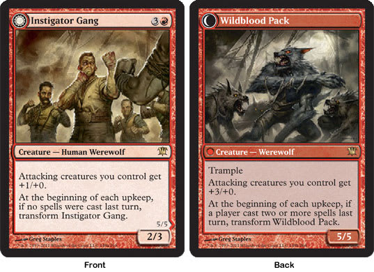 | |
MJS: This is fun. The abilities, art, and card names all work together and have synergy.
ML: Synergy.
MJS: I would have liked to have seen the werewolves look a bit more individual—referencing their human counterparts—just for amusement. But that’s nitpicking. The flavor package of this card feels right to me.
ML: I’m gonna nitpick that like hell, then. Card art that matches the front and back are easier to remember for new players—plus, they’re resonant. Yes, there are four humans and wolves in each one, but compare to the Mayor of Avabruck or Gatstaf Shepherd.

![]()
![]()
![]()
![]() – Sorcery
– Sorcery
MJS: I love this art and the card. It makes me feel claustrophobic, just like the scenes of the heroes shut up in the mall in Day of the Dead. The press of bodies, the lack of any outside light . . . ugh! It’s really gross. In a perfect, scary way.
ML: I love the flavorful design; the name makes perfect sense, and the flavor text works. The art has the thirteen bodies, sure, but is it effective? Does it emit horror? Are you nervous?
Wait a minute . . .
How many bodies?
Thirteen?
Count them.
I’ll wait.
The art dynamic forces your eyes to dart from zombie to zombie, but there are more than thirteen. That’s likely a development change, as artists get earlier versions. (Paint takes time to dry.) It’s a little oddity that sometimes occurs in card art when specifics are named.
![]()
![]()
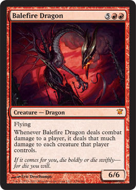
![]() – 6/6 – Creature – Dragon
– 6/6 – Creature – Dragon
MJS: I know a lot of thought went into the “gothic dragon” stylings for Innistrad, but Balefire falls flat for me. He’s as skinny as a drake, and his metallic sheen and angular lines make me think “machine,” which in turn makes me think “Mirrodin.” A gothic dragon should be opulent and ancient. And huge. Perhaps the entire countryside grows atop a green dragon. A white dragon might lie beneath the city with the unknowing cathedral as his municipal crown. The fact that gothic lore doesn’t contain dragons doesn’t mean we have to make them fit in. We can’t. Dragons do what they want. Maybe they’ve been there all along. This is Magic. Nicol Bolas says, “Dragons do not sidle up to cathedrals. We eat them like White Castle sliders.”
ML: A dragon wouldn’t go unnoticed atop a cathedral. I don’t get it. If this is indeed in Gavony, wouldn’t a dragon be just as heinous as a zombie, vampire, demon, devil, or werewolf? It’s not like it can hide, especially being a red-aligned dragon. I agree with MJ’s assessment, but people love dragons. Give the people what they want.

![]()
![]()
![]() – 5/5 – Legendary Creature – Zombie Warrior
– 5/5 – Legendary Creature – Zombie Warrior
MJS: Grimgrin has such a great name. But he just doesn’t look very menacing to me. He’s like the meaner big brother of the Gingerbread Man in Shrek. A tough cookie, but not going to make me run screaming. “Grimgrin” sounds so sociopathic; I would have liked to see this guy look totally apeshit and sadistic. The head tilt, his speculative gaze . . . I could have a good conversation with this zombie, and I shouldn’t be able to. I should be worrying about what he’s going to do with my kidneys.
ML: This is my guess for an alternate-art promo to be released sometime in the next few months. He’d be a fantastic candidate due to being a Commander. I hope he named himself. “Me Grimgrin!” “Yes . . . yes, you are.”

![]()
![]()
![]()
![]() – 6/6 – Creature – Avatar
– 6/6 – Creature – Avatar
MJS: I would have loved to have seen this from a bit lower of an angle so he was more imposing, but overall it’s a unique piece and I enjoy the color scheme Terese chose. His face and crown remind me of depictions of old Norse and Celtic gods, which works well with the idea of wilderness and uncontrollable natural dangers and wild powers.
ML: Keldon Warlord say what?
Terese has a great connection to Kessig’s color scheme, but what is going on in the background? Is that a fisheye lens? Avatars don’t get passes. Even if this thing is gigantic, that still wouldn’t distort. Just saying.

![]()
![]()
![]() – 4/4 – Creature – Spirit
– 4/4 – Creature – Spirit
MJS: Terrifying. I like that she’s wearing a purple gown, since this royal color seems to be very popular among the ladies on Innistrad this season. She’s glamorous and horrible at the same time, which is very characteristic of Innistrad. The only complaint: those ski-ball breasts. They’re absolutely distracting, and unless Innistrad has an active plastic (Phyrexian) surgery industry, simply against flavor.
ML: Banshees yell, in case you didn’t know or don’t play Dungeons and Dragons. They yell louder than MJ. True story.
If two to three elements were toned down, perhaps be a little subtler, this piece could be a hallmark piece of the set. Banshees are very flavorfully horrible. You don’t have to yell at us to show us the card. Showing dead creatures and others dying because of the mechanic isn’t needed.
Can the spirit fly? No? Because it sure looks like it. I see some “Rhox Bodyguard flying creature” art, but with a nerfed-in-development situation going on.

![]()
![]()
![]() – 5/6 – Creature – Zombie Horror
– 5/6 – Creature – Zombie Horror
ML: Trogdor!
MJS: The Blueninator! I feel like this guy just got back from a vacay to New Phyrexia, where he enjoyed spa treatments and bought a few extra arms at the Lumengrid gift shop. Do we know what a skaab is? This isn’t a favorite zombie. He looks hesitant to me.
ML: A skaab is a stitched-together (blue) zombie, compared to a necromantically raised corpse that was brought back by a ghoulcaller.
It needs 10% to 20% less blur, please. Fog is in Nephalia, yes, but fog is a very green concept. It needs some editing there. I like to remember Jon Schindehette’s advice that Photoshop filters can be used, but they should never be obvious or evident.

![]()
![]()
![]() – Sorcery
– Sorcery
ML: Maw?
MJS: Oh God, is that horse getting hurt!?
ML: This is cast to blow up a tree? Seems like overkill to me for a tree and a reference to demons and devils . Hmmm . . .
That art is crazy-confusing.
MJS: The horsey, Mike, the horsey!!!
ML: I heard you.
Poor horse.
True story: My fiancée’s nickname is “Mini-Horse.”
Even marauding soldiers don’t usually kill horses. They’re just too valuable.
![]() – 1/1 – Creature – Human Soldier
– 1/1 – Creature – Human Soldier
ML: Check that high-resolution art. Mmm.
Two very different things on this card related to medieval history: choices of dagger and medieval career. This type of dagger isn’t medieval, but rather a later development, as it isn’t a flat blade. Trench knives existed, but they weren’t practical . . . To kill a werewolf, it absolutely works because of the close-contact fighting. I’m not sure if it’s the creative team or Velinov, but kudos. As to the flavor text, the three “career” choices named were very common choices to nearly every medieval city. What’s missing? Blacksmith. They fixed more farming implements than blades. True story.
MJS: The style isn’t really my bag, but this guy is big and sturdy and looks like he can really kill things. I approve. More normal-sized guys, fewer waifs and steroidals, please. This is Innistrad. They don’t get facials, and they don’t have money for creatine and 24-Hour Fitness. They eat whatever they catch or grow, and have muscles that come from working the land or running from creatures from the dark . . . or fighting them. These people aren’t leisurely, but they sure aren’t concerned about looks. This means they’d have very different body types than what our modern vanity generally wants to see. Think about it.
![]()
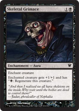
![]() – Enchantment – Aura
– Enchantment – Aura
ML: Wat.
This card makes absolutely no sense to me.
Card name: Skeleton face with a type of facial expression usually of disgust, disapproval, or pain.
Art: A non-decomposed person with the skin and muscles of the face missing.
Flavor text: A black necromancer who alludes to necromantic abilities being blue for control magic.
What?
So what Skeletal Grimace is trying to convey is that a ghoulcaller can make a living person fall under his or her control? But . . . he’s missing a face. Living people usually need faces, from what I understand. (Unless it’s a movie with Nick Cage in it, but then, anything goes.)
Am I so wrong to question what’s going on here? ’Cause I’m wicked confused.
MJS: I take back what I just said on Champion of the Parish. Apparently, they do get facials on Innistrad. Reverse facials. The Brazilian bikini wax of the ghoulcaller.

![]()
![]() – 4/2 – Creature – Zombie
– 4/2 – Creature – Zombie
ML: His Dexterity score must have been way over 18 when he was alive for him to be dead and have similar motor skills. Mr. Hayes, I like your classical visual reference. I feel like a Greek tragedy “horror” is upon me.
MJS: Nice sky! I don’t like the guy at all. He looks cranky and like he’s made out of Play-Doh. Oh snap—that’s a Hasbro product, too? Maybe it was intentional! I just turned into a cross-marketing pawn. As Mike would say—
ML: Oh, biscuits.
![]()
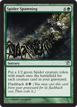
![]() – Sorcery
– Sorcery
ML: Horrible. Scary. Dark. Innistrad.
A ton of spiders being created or summoned to replace each dead creature feels pretty terrifying to me, and I love spiders. Spiders annihilate mosquitoes, and with over fourteen thousand lakes in Minnesota, anything that eats mosquitoes is a welcome change.
These are 1/2’s, though, and most humans are 1/1’s. They gonna eat me in this . . . hole? Where are we? Are we in a crypt? That would explain the lighting and the stone walls. Mausoleum, maybe?
MJS: I just literally shivered. And my skin feels tickly. Aaargh!!!

![]()
![]() – Enchantment – Aura Curse
– Enchantment – Aura Curse
ML: Semi-abstract art? Neat.
The flavor text doesn’t explain what a crossway is or where the art takes place. Is this Kessig? Gavony? I’ll assume Kessig, because I love me some Kessig.
I love how curses need not be evil. This is a very D&D concept. Who didn’t curse a sword to his hand so he doesn’t roll a 1 and throw it into the woods? C’mon now.
MJS: I see tentacles la la la, la la! Evil Dead, anyone?
ML: Yes, sigh.
MJS: And too much bloody hair again! She can’t watch for danger with that shag in her face. Basics, people!

![]()
![]()
![]() – 5/1 – Creature – Spirit
– 5/1 – Creature – Spirit
ML: To understand what’s going on in a Magic duel, one must know that each player is, in fact, a planeswalker. Jim McMillian versus Judy Jenkins is really a planeswalker duel on Friday, Friday, Friday. In understanding this point, a planeswalker would summon this spirit, then “unsummon” it, more or less, with its ability and rearrange his mind to spill out creatures onto the battlefield dead. Maybe he would do this to focus or to separate random spells from the one he needs. Maybe this spirit acts as a mage’s familiar to aid the planeswalker.
The mirror in the art is just gravy. The hallway is in the planeswalker’s mind, and the spirit looks to find itself to aid the planeswalker! Flavorful indeed.
MJS: That spirit looks so confused—it’s hilarious. Lyon strikes again, this time with some funny.

![]()
![]() – Sorcery
– Sorcery
ML: This card has one of the best flavor-text pieces in the entire set. It’s concise and it ties to the card and tells of a greater evil, thus building some semblance of tensions for Dark Ascension. Ascension!? Clearly.
Another example of seeing a viewpoint from a human’s perspective. (It’s a short human’s view, sure, but, regardless, you see the bent church supports in the background.) If you’ve ever been to a massive medieval church—Notre Dame, for example—you’ll see how an architect’s intention is to force parishioners to look upward and share the transcendent “Oh, my God.”
MJS: Sad. In this case, it means it’s good. That is a really good quote from Thalia, Knight-Catheter.

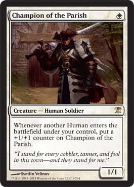
![]() – Artifact – Equipment
– Artifact – Equipment
MJS: Wicked cool. No vegans on Innistrad, baby!
ML: This is exactly correct. Here’s another top-down gold star.
It’s appropriately costed, the power bonus fits, the human mechanic makes sense, the art shows a grisly scene that fits the horror-set aesthetic, and the flavor text ties everything together.
I keep thinking that rural villagers aren’t wealthy. They won’t choose a farm implement or a weapon. They’re smart enough to know that multiuse tools are a necessity. It’s cheaper, and it’s harder for others to steal. If you have four swords on the wall, what if the perpetrator takes one of those weapons to use against you? In addition to lowering redundancy, how proficient will a random person be with your meat cleaver? This is why the second ability makes perfect sense. You’re gonna eat that wolf if you kill it. A vampire doesn’t care to eat someone—it just feasts on them.
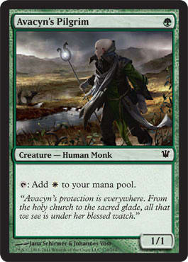
![]() – 1/1 – Creature – Human Monk
– 1/1 – Creature – Human Monk
ML: I can imagine a wonderful little story about this pilgrim.
He’d be a great Mad Libs candidate. Can someone get on that?
The name, art, and flavor imply the reach of Avacyn. The card picks up on the mood of the set and the mood of the people. “She” has pilgrims, but is it all false hope? A nifty staff doesn’t fix a poor harvest or ward off all manner of evil creatures. He’s preaching a lie to the common man, despite his best efforts.
This is top-down design, and it’s deep.
MJS: That’s a really thin staff. And a really bald head. I like it, though—he’s earnest in his posture and believes in his journey. What is he looking at? What caught his eye? A lot of interest here.

![]()
![]() – 1/1 – Creature – Human Wizard
– 1/1 – Creature – Human Wizard
ML: The name is perfect, and I love the ability, but the flavor feels too easy to fit.
The art fits the aesthetics of horror, but I wish there wasn’t so much purple in the set. That’s the Eldrazi’s jam. They love purple! Even the eldritch of Fantasy Flight Games’ lineup is all about purple. Yes, purple is horror, but perhaps this took too much grape Kool-Aid mix.
MJS: I thought we just liked purple in Curse of Death's Hold and on that banshee chick! Mike, you confound me. Garl is quite funny, and the art is unique. I saw this and read “Dental Assistant.” That’s just me, though.
![]()
![]() – 2/2 – Creature – Human Wizard
– 2/2 – Creature – Human Wizard
ML: Here’s another piece of artwork where the leveling tool is off-kilter by about 15%.
This art is asking for a Dexter’s Lab alter.
It’s not quite steampunk, and not wholly mad-scientist, either. The center circle is a bit Iron Man for me, but I love the lever on a Magic card. Win.
MJS: The circle is extremely Iron Man.


![]()
![]()
![]() – 5/3 – Creature – Angel
– 5/3 – Creature – Angel
MJS: She is pretty glorious. The costume choices—helm; nunlike, flowy whites; and steely breastplate (except for the overly formed boobage)—give an Innistrad-specific feel.
ML: This is fantastic digital lighting. I would argue that Chan has one of the best abilities to control light among artists in the fantasy-art world right now. Look at how the top of her head and sword fit the lighting schemes. The sword isn’t a high-school-level picture—overly Photoshopped at a Ren fair—it’s exactly what it is supposed to look like. I love it when artists hit it right on.
Despite the perfect lighting, look at how the piece was cropped. I doubt Jason Chan painted only part of the wings. The card art is very, very small, and this canvas is where great art directors show their chops in creating the best image within the parameters they have. I’m sure they wish they could go to a full artistic depiction, like alter artists use, but, if nothing else, alter artists have a template to work from. You really think the art directors aren’t aware of altering art and how to lob you a softball? C’mon now.
ML: I feel like after looking so critically at each piece flavor-wise, I’ve become very negative—a typical Vorthos who has joined the hatedom.
It makes me sad, and I feel that the luster of transcendence isn’t sticking with me.
I felt that way when I learned which parts of the Louvre really are terrible to see, or when I learned the process behind writing flavor text. It is rarely glamorous, and keeping the faith is very, very hard.
With that in mind, I venture on.
MJS: Mike, being a nitpicky bastard is different than hating. You are living the glam life for all of us, righteously carrying that baton. May Avacyn guide your way. I’m just saying . . . someone has to do it.

![]()
![]()
![]() – 2/2 – Creature – Vampire Warrior
– 2/2 – Creature – Vampire Warrior
ML: I asked John Dale Beety, of SCG Compulsive Research fame—yeah, he’s a Vorthos—what he thought about this art, and he said, “Wings aren’t lining up with bodies.”
You could create a collaged painting of a figure with wings beneath, but painting differs from digital art in this aspect quite visibly. Painting has to blend or be very cognizant of borders, and digital art can omit this at times.
Always remember the fifth of November and your layers when you submit a final proof!
MJS: It’s true, the wings aren’t where they should be. But this art did catch and hold my eye, and I enjoyed the saturated red and flamboyant vampire postures. Their aura feels right; my critique is that the entire look seems lifted from this Gargoyles episode:

ML: Indeed.
Bronx was my favorite. He was a souped-up bulldog.
![]()
![]() – 3/2 – Creature – Human Warrior Werewolf
– 3/2 – Creature – Human Warrior Werewolf
 | |
MJS: I like this for very visceral reasons. It depicts what we’d all like to do when bullied.
ML: This is a perfect use of the background on both sides. I don’t love it because the homes are the same, but because the moon differs: Time has changed.
The werewolf side has the same layering issues with the humans as described in Falkenrath Marauders, above.
The first flavor text works, but the second falls a little short. It feels too connected to the art. What if it were to describe the guilt the pariah holds for killing those who don’t understand? He’s aware of his power, but he doesn’t like it. He just wants to be accepted. Loved. If he must eliminate “evil” people, so be it. Should the flavor text be in first person? Third person? A current event? A summation? A thoughtful reminder? A heartfelt connection to other marginalized people?
Flavor text can be very powerful. When art and flavor text move from an obvious expression of describing a scene to something greater, the top-down design moves from clever to contemplative, and when you put the card down, you can relate it to your life. Video games have tapped into this, and Magic cards have the opportunity as well. The only issue is that you have less than a Tweet in which to do so. I don’t think it’s insurmountable, but we’re only in the first set of the fifth state of design. I’m really looking forward to upcoming sets . . . and the weekend, of course.
![]()
![]()
![]() – 3/3 – Creature – Human Shaman Werewolf
– 3/3 – Creature – Human Shaman Werewolf
 | |
ML: I want to know more about the Ulvenwald. What is it adjacent to?
P.S. “Wald” is German for “forest.” Germans love making complex concepts or compound words into a singular thing. It’s not quite Icelandic or Norwegian, but it’s close.
As we know, I’m a fan of reusing backgrounds for resonance, but the glow of the pot on the werewolves actually helps this quite a bit.
MJS: I agree—the green glow totally sells it. These might be my favorite werewolves so far—anatomically, they’re less awkward. The muscling and detail on the forelegs is really nice.
![]()
![]() – 2/2 – Creature – Zombie
– 2/2 – Creature – Zombie
MJS: I propose this alternate flavor text: You’re just damage control / For a walking corpse like you, like me. — “Portions for Foxes” by Rilo Kiley.
ML: Hipster.
I can follow this. Skeletons are 1/1; zombies are 2/2. I don’t know if a zombie could take on a Grizzly Bears in a fight, though. I’ve always been taught that if you’re being attacked by a grizzly bear, and you don’t have a gun, a mace, or a mace gun, you aren’t long for this world.
So it’s hopeless. Got it. This matters. Write it down.
![]()
![]()
![]() – Instant
– Instant
MJS: I’m confused—is the big devil facing away from us? Or is his tail coming out of his crotch? The angles in the composition and the quality of the sky are great—I really like this. It’s like a dance between two devils. The hammer positioning and posturing of that larger demon is just slightly off, and that moment of distraction takes me out of fully engaging with the piece.
ML: I love the name with the diabolic subtlety. Even the blue LA Gear light-up feet work for me.
The art works for me, even with another perspective shift. Look at the ground.

![]()
![]() – 2/2 – Creature – Human Soldier
– 2/2 – Creature – Human Soldier
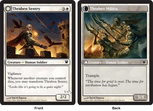 | |
MJS: Whoa! So this guy flips from a man . . . to an orgy of spears! The Sentry art is really powerful, and I like the something-is-coming feeling we get from the birds a-flight and the turn of the sentry’s head. The Militia illustration is very active, nuanced, and also quite good—I just wish the pictures contained more linkages from one to the other. It’s already an odd starting point with the one guy turning into a group. The bald guy is back there in the fray on the flip side, but the other visual connections should have been beefed up so you really saw the “Mess with me, mess with my posse!” theme of the card.
ML: I agree with MJ here. I would love the bald “good-eyesight” guy in front, pointing or gesturing to whatever menace is coming. Watchers atop walls were invaluable to city garrisons. They often were the best archers and weren’t sent into direct battle because they were too valuable.
This card is super-annoying to deal with in Limited if you don’t have a burn spell, because once the militia is up, they aren’t going to bed until something’s dead. I wouldn’t want to return to cold eggs and bacon, either, unless whatever I was roused from wouldn’t interrupt again. Medieval fruity pebbles turn soggy twice as fast. True story.
![]()
![]() – Instant
– Instant
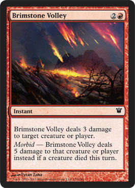
MJS: Really like the fuchsia tones in the firebombing here. It makes it looks like something other than “regular” fire, speaking to the Brimstone designation in the name. And it’s red burn—yeah!!!
ML: Talk about great commissions for Eytan Zana. Lands, a removal spell that’s Constructed-playable, and the best nonbasic land: Kessig Wolf Run. That’ll make for a sore card-signing hand during a convention.
I first thought this was a “pickup” art: a piece that was in the past and reused. Once I realized that Zana received other commissions, I discarded the notion. The reason I thought this was the case was that, um, it looks a lot like Stone Rain. Warning: Vorthos being practical. Was Stone Rain supposed to be printed in the last two years? Doubtful, but I’m just saying. Maybe. Nahh. But maybe.
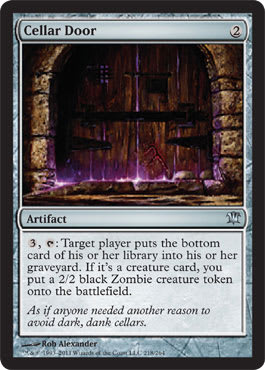
![]() – Artifact
– Artifact
MJS: Uh oh, what purple menace is coming through those cool doors???


ML: Grimace was my boy. Used to be evil. He’s also black, apparently.
I do wonder how many other horror tropes will be used in the next two sets. Log onto tvtropes.org and start counting. Might help for future speculation . . .

![]()
![]() – 2/2 – Creature – Vampire
– 2/2 – Creature – Vampire
MJS: He gets the party started! Turn up the Gaga and pump your dudes. Absolutely. Maybe pop some performance-enhancing goodies on the way, yeah? As vain as vampires are, the image of them having sloppy eating habits persists. Is this thought out, or is it just humans making gratuitous artistic choices that keep getting repeated?
I’m not even going to start talking about these outfits. Maybe Mike will take the low road for a
change and give us some commentary on the . . . uh . . . leather and lace-up.
ML: Heirs are parasites. Great family wealth rarely—and I mean rarely—lasts into a third generation. These vampires are just here to party. Marie Antoinette–style. “Sexy” only gets you so far in life. I like how they balance their chest hair, you know, for masculinity. And to MJ’s delight: High-resolution is here.
There is no link. C’mon meow. You can e-mail either of us anytime to talk flavor—you should know that by now, and the GatheringMagic apps aren’t quite ready yet. They’re marinating . . .
Also, there is no spoon.
Whoa.


